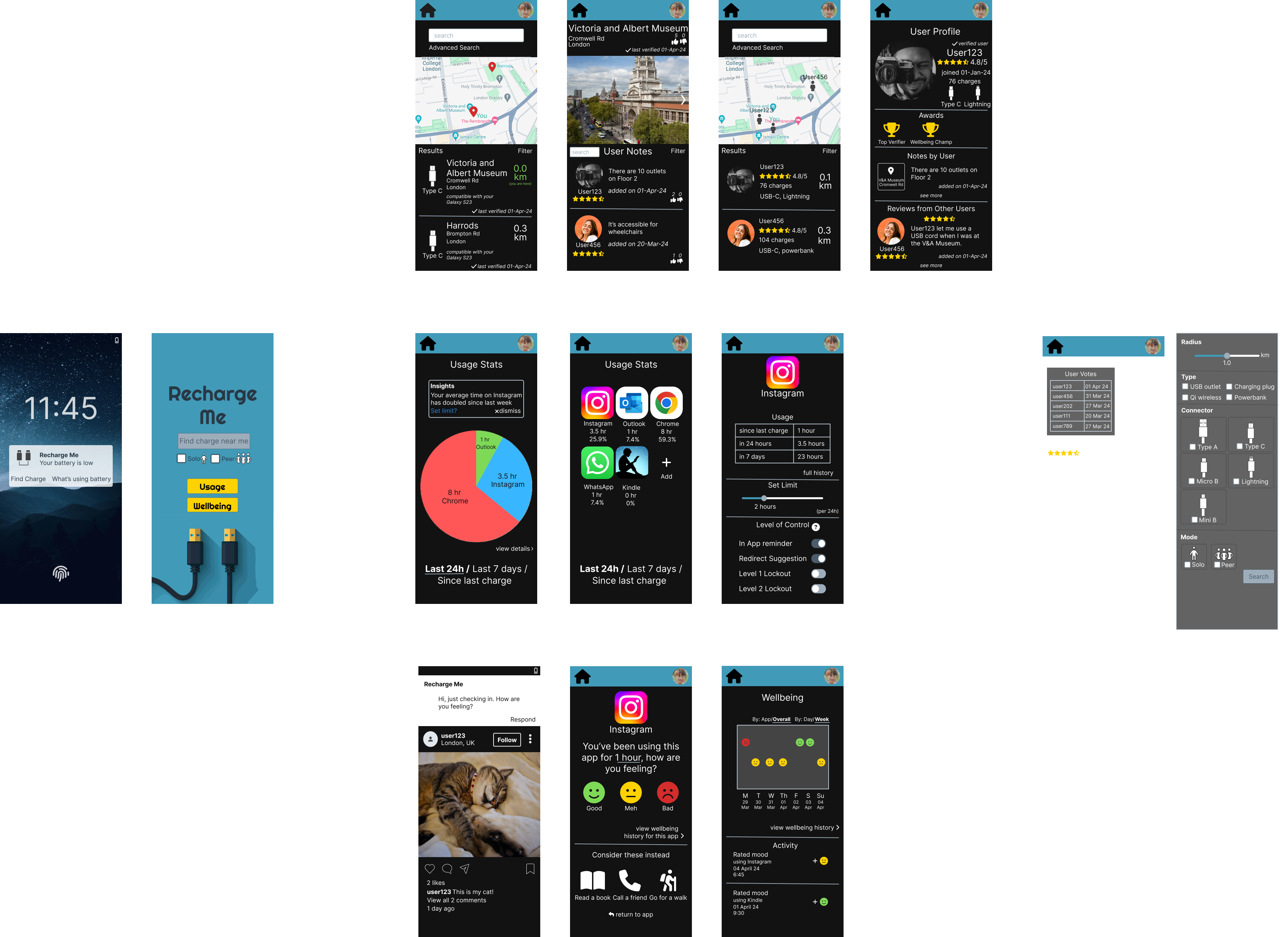
Project Title: RechargeMe

A mobile application to recharge your mobile device and mental battery on the go

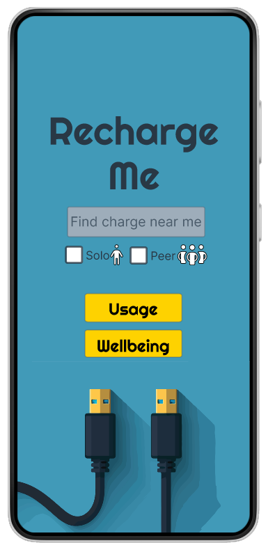
Screenshot of rechargeme mobile app home screen.

Project Overview

Team Size: 1 (Solo)
Roles: Research, Visual Design, Prototyping
Timeframe: 3 months (in parallel with Food Stock)
Platform: Mobile (Android)
Summary: RechargeMe is a mobile application to help people manage phone battery by enabling them to seek out charging sources solo or from other users or reduce use through digital wellbeing interventions

Quick Navigation (click any image to enlarge in new tab)

Introduction

(click to expand)

Project Brief

The brief is to plan, research, design, prototype and formatively evaluate a multimedia, multimodal application of personal and ubiquitous computing that supports a digital lifestyle. Select an aspect of contemporary life and show how user experience could be enhanced through the innovative use of personal computing, smart environments, ubiquitous technology, and cloud-based information. Define the scope and also the design process – the sequence of prototypes produced, whether there is an opportunity for iteration, and what kind of data gathering is conducted. How well work is scoped and the design process is constructed is part of the exercise. The project should be guided by qualitative user research, for example, interviews and/or diaries and/or informal observation, focus groups or surveys. The project should also include informal, formative feedback from end-users on at least one of the prototype(s). The design should also clearly be one touchpoint of a user journey, i.e., a single overarching purpose or activity conducted over days, weeks, and months that comprises a series of related touchpoints spread across multiple access channels. The design should be innovative and reflect contributions from end-users and other stakeholders.

Problem Statement

The problem to be solved is the issue of a mobile device running out of charge at inopportune moments without a way to recharge as well as the additional issue of device dependency negatively affecting mental wellbeing.

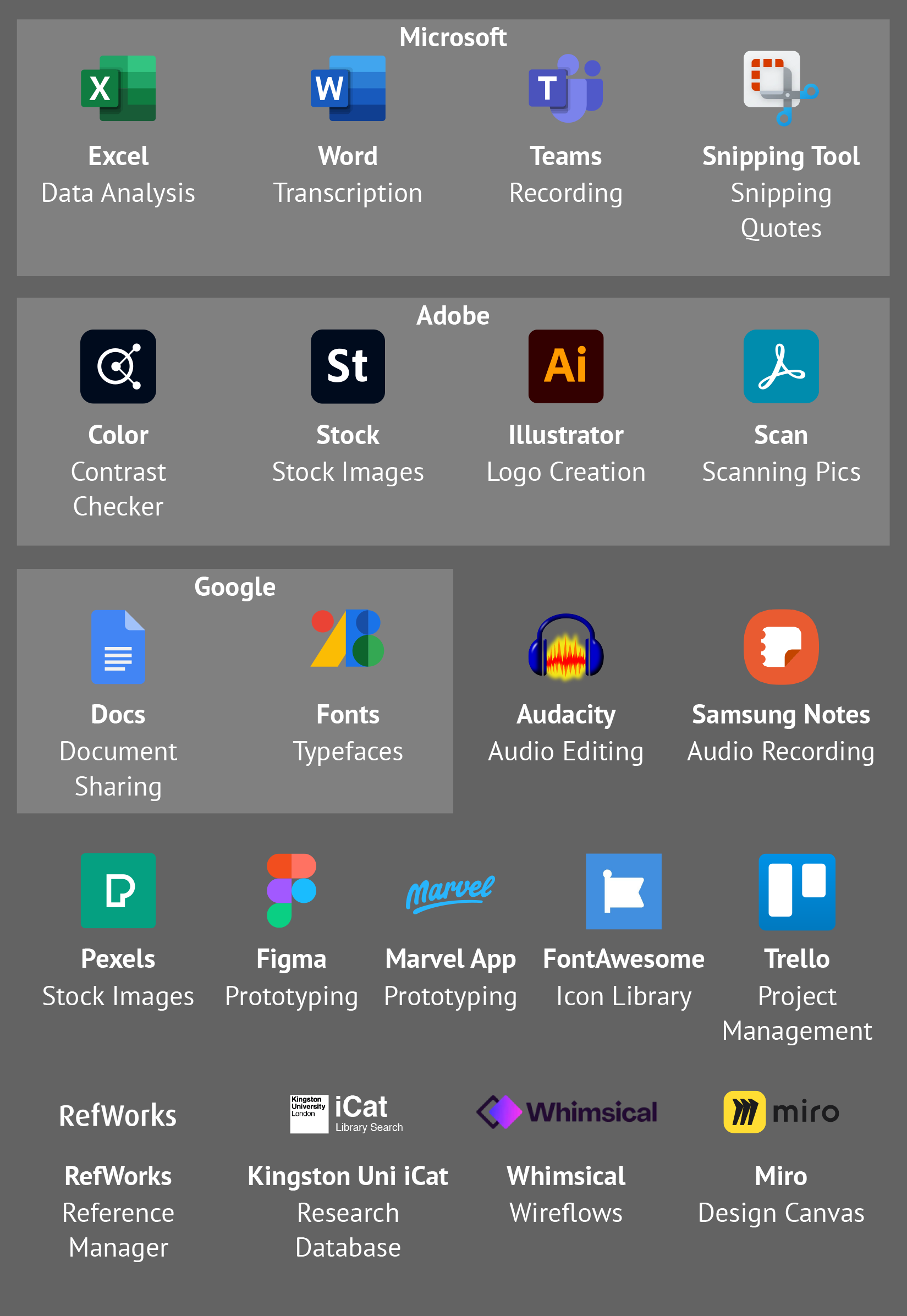
Tools Used
Design Method

I selected "Design Thinking" for the design process to follow for this project.
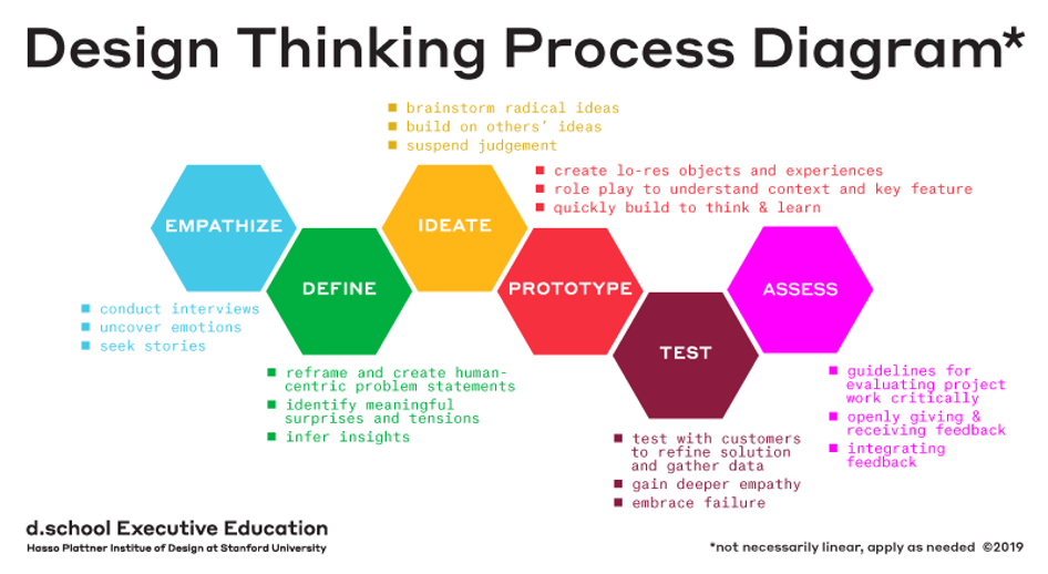
Diagram of Design Thinking process phases of Empathize, Define, Ideate, Prototype, Test, and Implement.

Project Management

I used Trello to create the project plan gannt chart and kanban board to track my work. I picked Trello because of its accessibility for my team of one. I was able to use it off the shelf because I didn't require a high degree of customisation like custom fields or workflows. I needed to keep it simple, hence the decision to use kanban. As long as I could easily see and limit the WIP, it was enough. I also like that Trello has the ability to add "powerups" for things like creating a gannt chart.

I developed the project plan to align with key milestone dates. In this case, the key milestones dates were the hard deadlines set by the university. A deliverable was required by each deadline, so what I did was name the milestone after the deliverable and nested each individual activity and associated artifact to be completed underneath it.

The Design Thinking framework includes different stages of activities, so I broke each set of activities into their respective stages. There was an expectation in the final deliverable to include artifacts from at least one iteration of all the stages. Thus, due to this expectation, the plan follows a more linear timeline than one would expect from Design Thinking. Due to the compressed timeline to conduct all these activities, I wasn't able to include as much buffer time between activities as I would have liked.
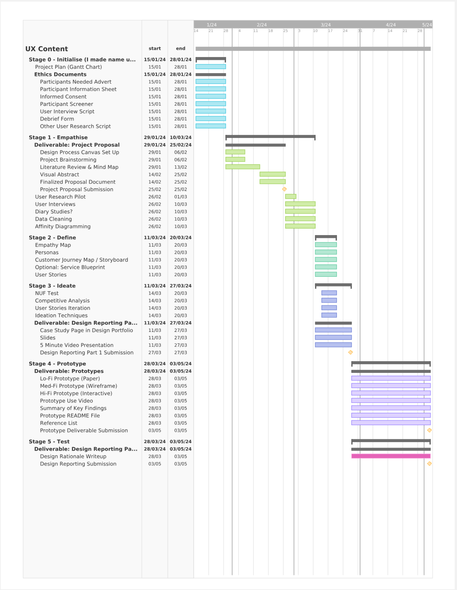
Gantt chart showing project timeline from January to May 2024.

Competitive Analysis

Indirect competition exists as native features within various apps, such as Instagram. However, the major drawback is that it only pertains to data of the specific app and is not holistic/device-wide.
Apple and Android phones also provide native features to view usage, but it involves going into each app’s settings individually and is also not a holistic view.
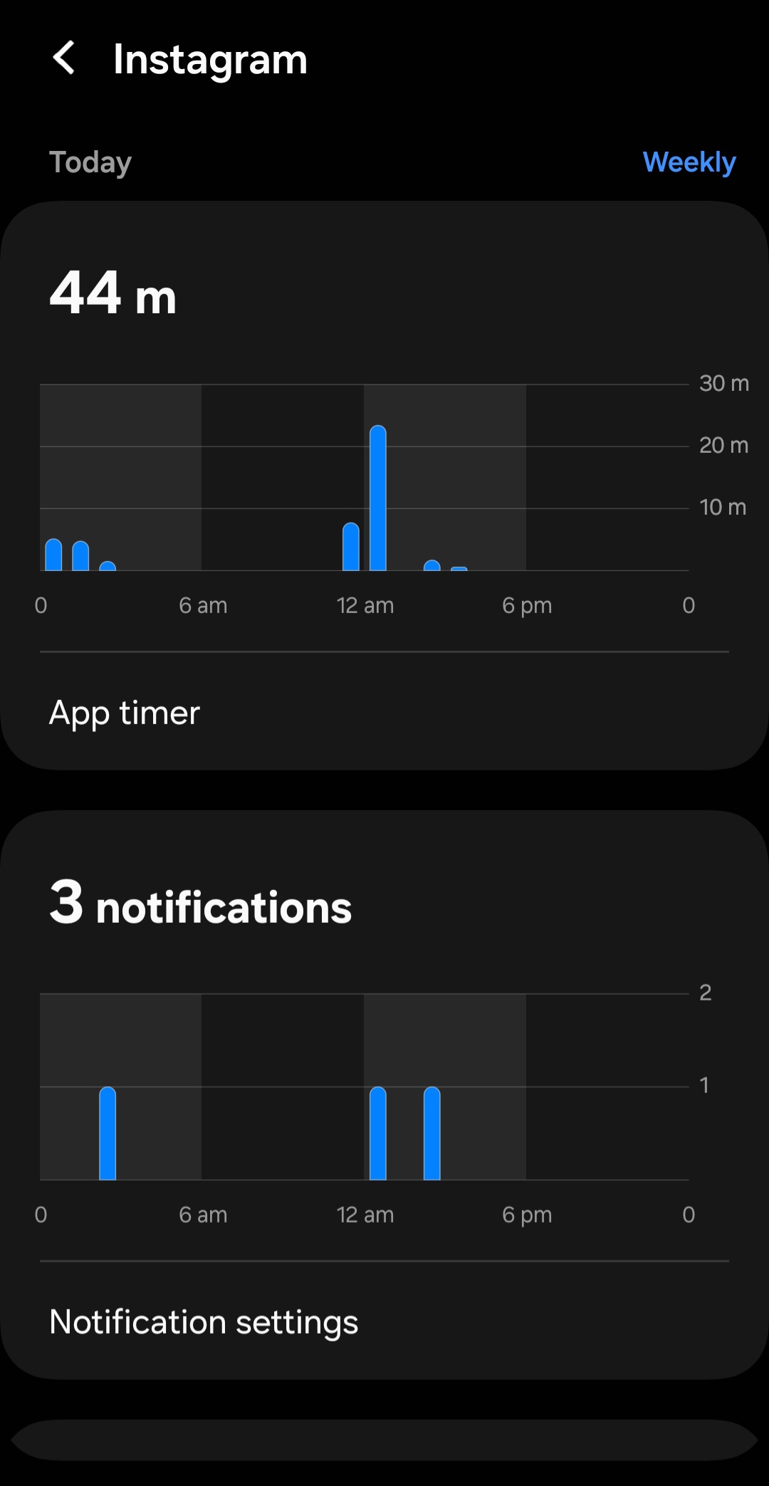
Below are examples of these native features:
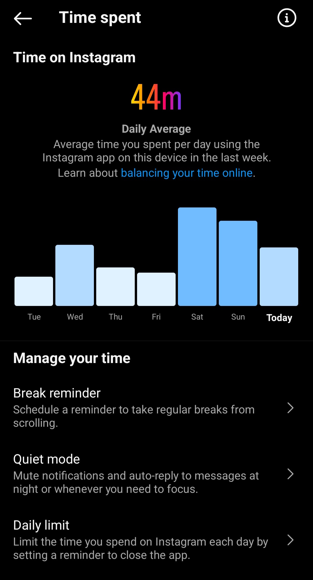
Instagram's Native Feature (“hidden” in Instagram’s architecture and also unknown to all participants interviewed)
Samsung's Native Feature (individual app settings)

Empathise

(click to expand)

Background Research

The basis of the idea is centred on the idea of energy exchange. The user of the proposed app would be seeking energy, which has to come from somewhere. The starting point for research was around charging methods and infrastructure. In the course of reviewing the literature, another focus area emerged in how people’s relationship with the device influences their usage patterns and motivations. The two focus areas inform one another. Thus there is a secondary basis to the idea that it is not just about seeking energy but also managing it. When exploring the question of logistics of charging infrastructure, it was discovered that a large body of the literature on the subject of battery life and charging focuses on battery electric vehicles (BEVs). However, some of the terminology and problems faced with BEVs could be applied to any device that is powered by a battery, including mobile phones. While there is certainly a logistics component, there is also a psychological component as well, and that is the concept of “range anxiety”. Neubauer & Wood (2014, pp. 12-13) define range anxiety as the fear of fully depleting a BEV's battery in the middle of a trip, leaving the driver stranded. This anxiety can cause drivers to employ alternative (gasoline-consuming) means of transportation even though their BEV is capable of adequately completing their required travel. This thought pattern of being reliant on a battery-dependent device in situations such as using the phone for navigation and adjusting behaviour in response to mitigate depletion applies to mobile devices as well. The other trend from BEV-focused literature is the idea of peer-to-peer charging. There is a small body of work that explores this concept with mobile devices. Bulut, Hernandez, Dhungana, & Szymanski (2018) describe “two sides in achieving peer-to-peer charge sharing. First, the receiver phone should have the capability of receiving the power and storing it in its battery. Second, the power sharing phone should have the necessary equipment for transmitting the power from its battery.” They noted that for phones where it’s not built in, third party accessories can be used.

Once logistics and distance anxiety were identified, the next step was to analyse usage and charging habits to uncover other potential anxiety or mental dimensions. Dhungana, Arodz, & Bulut (2019, p. 2) explores charging habits noting that “most of the users charge their devices opportunistically with short charging sessions and more frequently than they really need [7,10] to keep their devices with as much power as possible.” When categorising usage patterns, Dai, Tai, & Ni (2021) noted that “time-based use characteristics generated a typology of four distinct user groups: hypo-connected antagonists, balanced majority, hyper-connected enthusiasts, and indulgent zealots. Habitual usage falls on predictable patterns matched onto temporal, locale-based and contextual cues and triggers. Students’ dependency relationships with the smartphone have both functional and emotional dimensions, as prominently manifested in occasions of detachment from the device. Self-regulatory effort in monitoring and limiting use is significantly impacted by mental focus and personal goal setting.”

After understanding these patterns, the focus was expanded to understand exactly what exists to support this self-regulatory effort in monitoring and limiting use. The overarching discussion in the literature appears to be around the idea of “Digital Self-Control Tools(DSCTs). According to Roffarello & Russis (2023, 53:2), “DSCTs aim at supporting self-control over technology use by allowing users to track their usage patterns and to define interventions, e.g., timers and lock-out mechanisms [159], on their different devices and online services. As they are ideally intended to help users improve their behaviors with technology, DSCTs can be viewed, from a broader perspective, as a technology for behavior change and sustainment [77], or, more specifically, as digital interventions for behavior change [178].”

Primary data collection consisted of two methods.

1. Semi structured user interviews

What:
Why:

2. Diary studies

What:
Why:

User Interviews

Recruitment for both methods was an abbreviated process due to affiliation with the university at the time of the project. I was able to approach people around the university fitting the representatitive profile (X)

First page of an interview transcript.

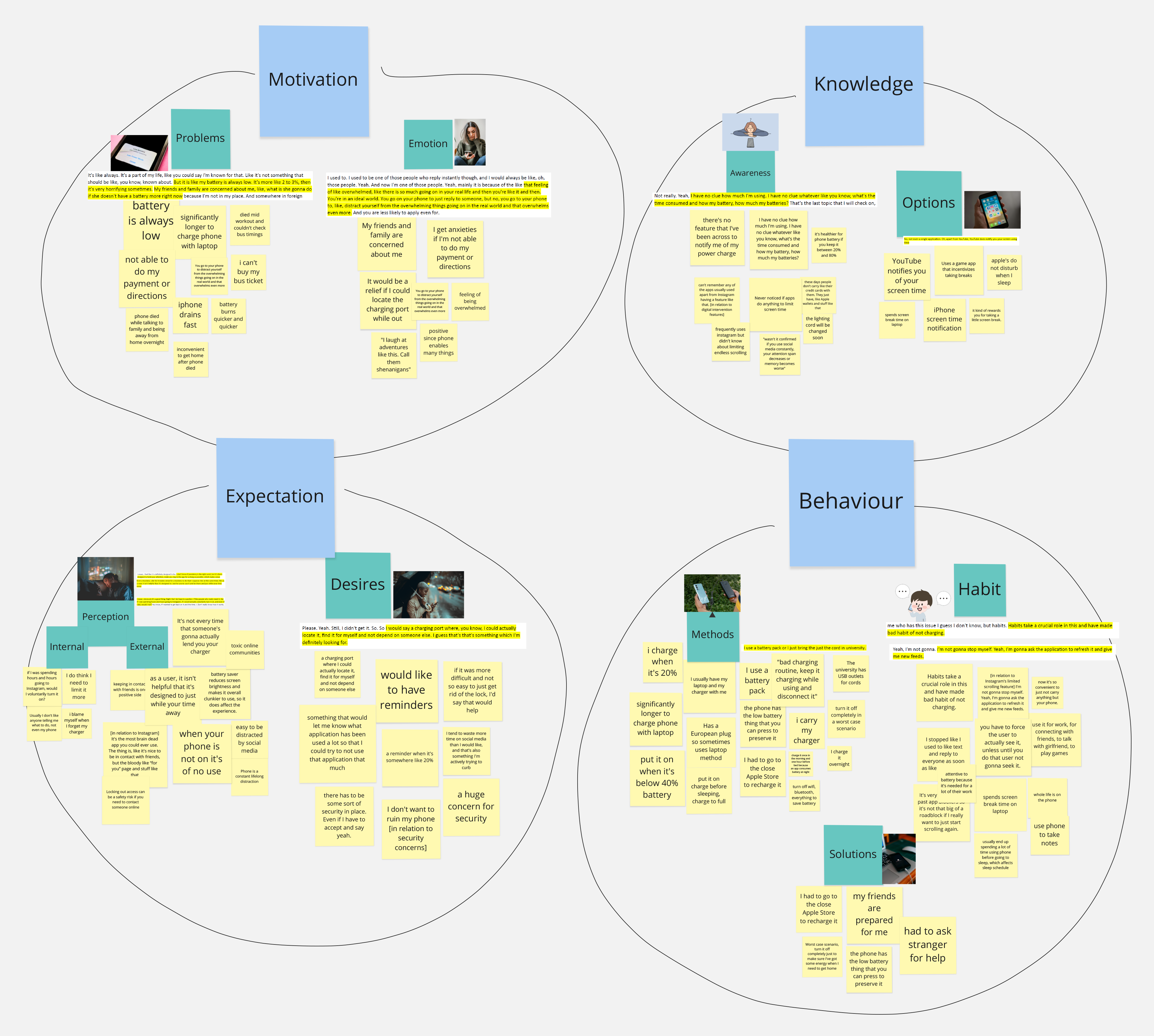
Affinity Diagramming & Thematic Analysis

After the data was collected, I extracted key information from the interviews onto sticky notes. After I created the sticky notes, I did affinity diagramming to identify patterns and sort them accordingly into groupings called "codes". X codes emerged at the end- placeholder

4 groupings of digital sticky notes with key phrases from interviews on them.

Define

(click to expand)

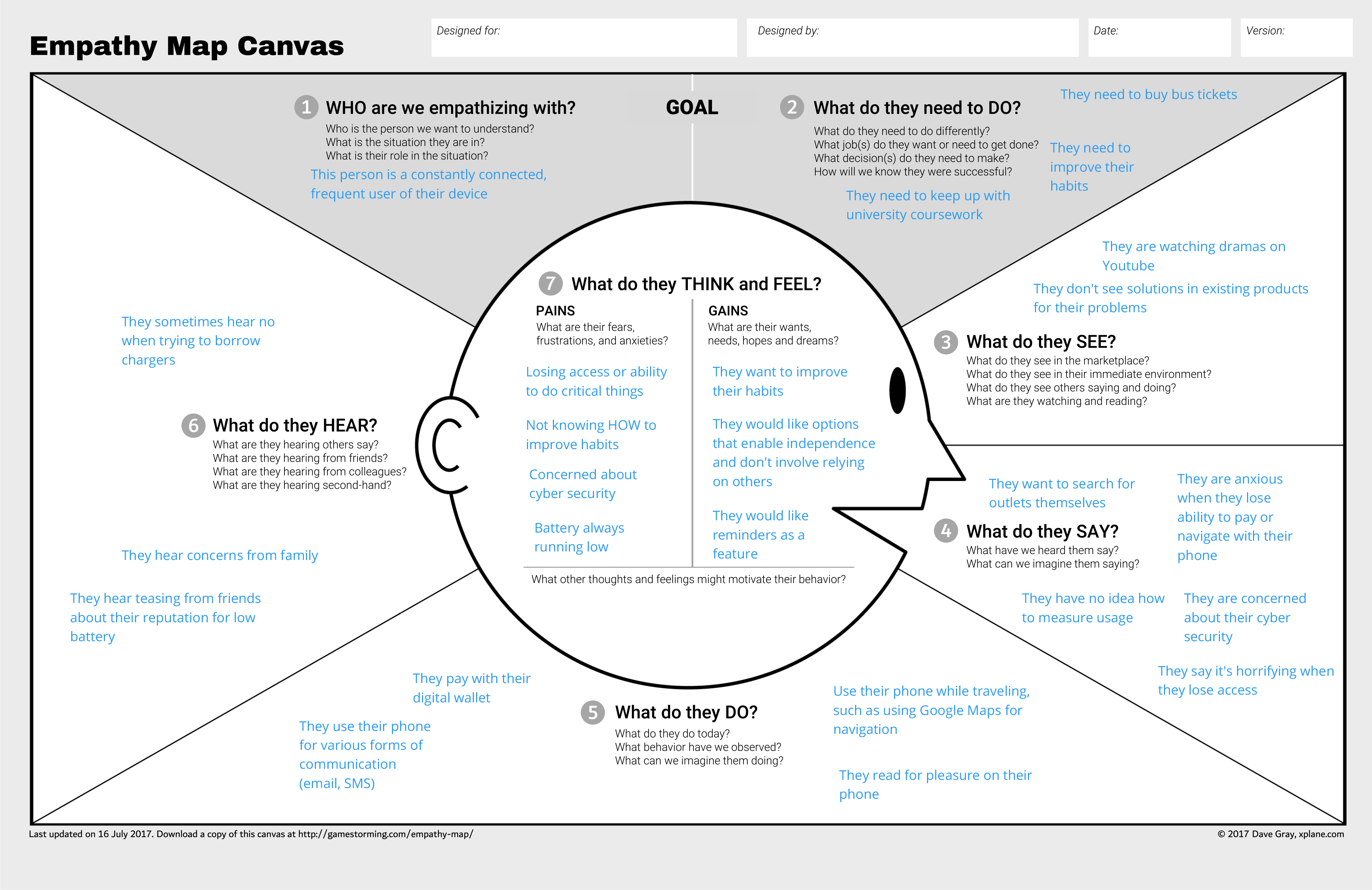
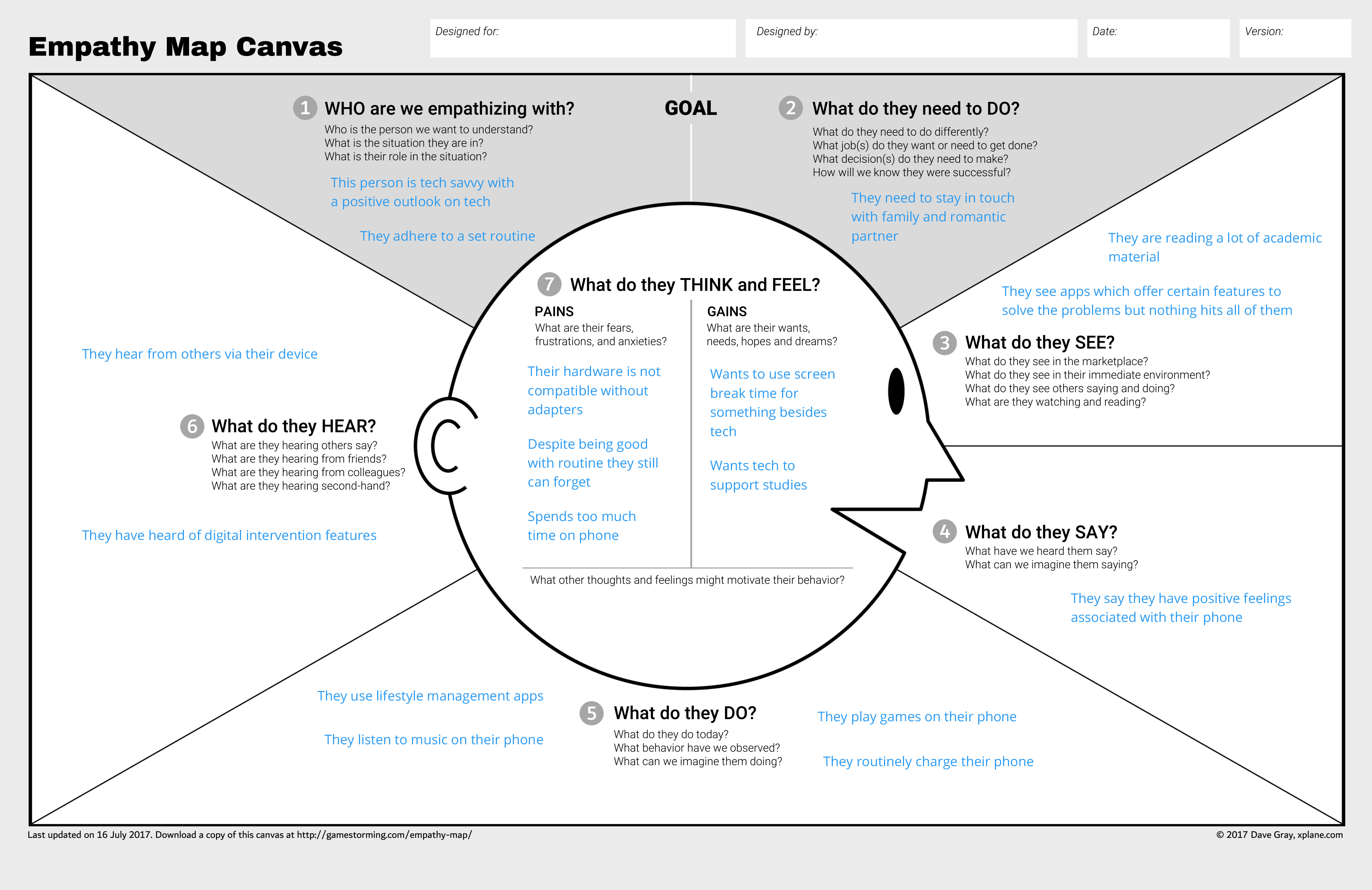
Empathy Mapping

The next step following the Empathise stage was to summarise qualitative data into a format I could reference while creating user personas. Using both information from interview transcripts and codes and themes uncovered from affinity diagramming and thematic analysis, I created two empathy maps.

Cartoon style illustration of a person's head with text about what the user thinks, says, hears, and sees. Cartoon style illustration of a person's head with text about what the user thinks, says, hears, and sees.

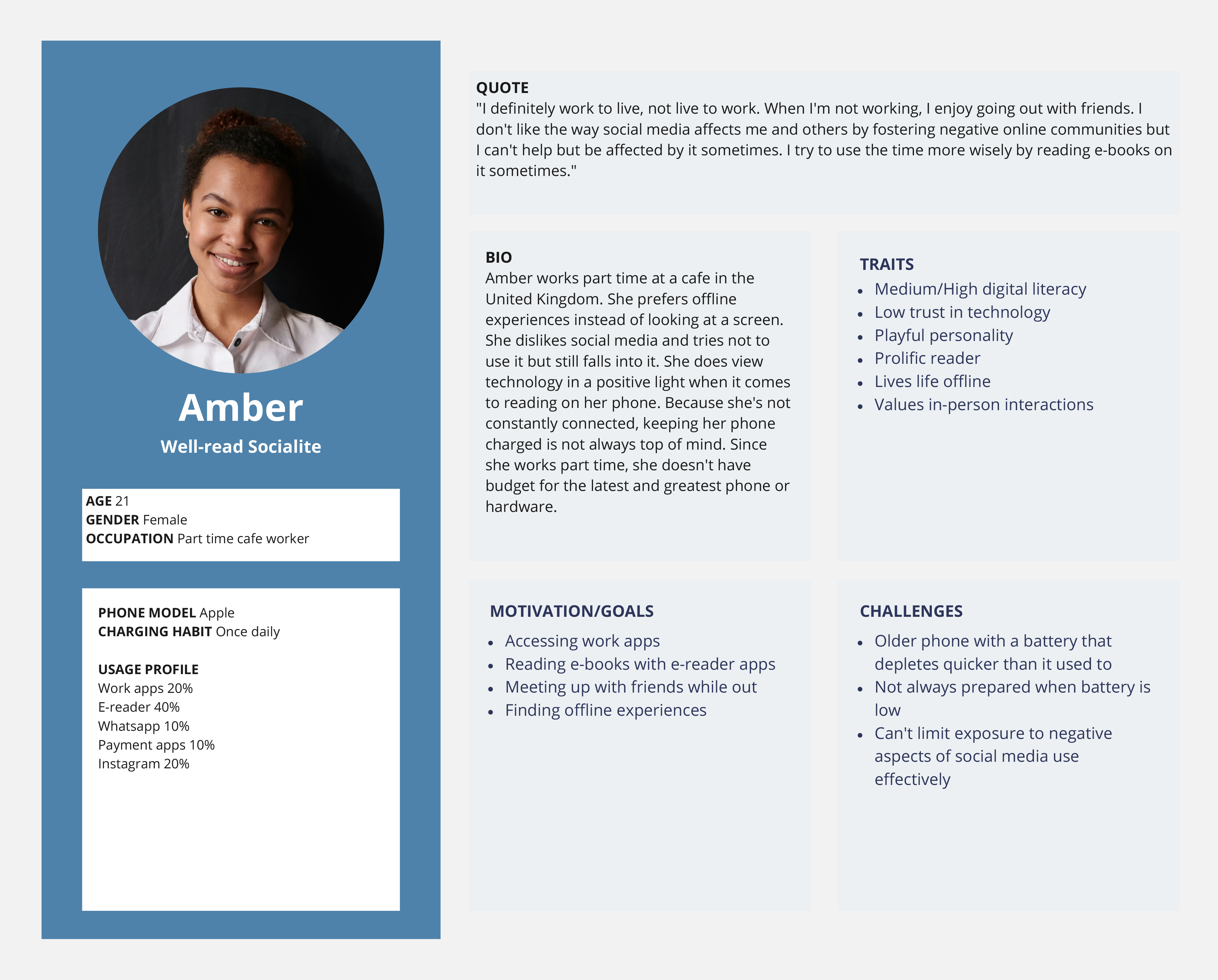
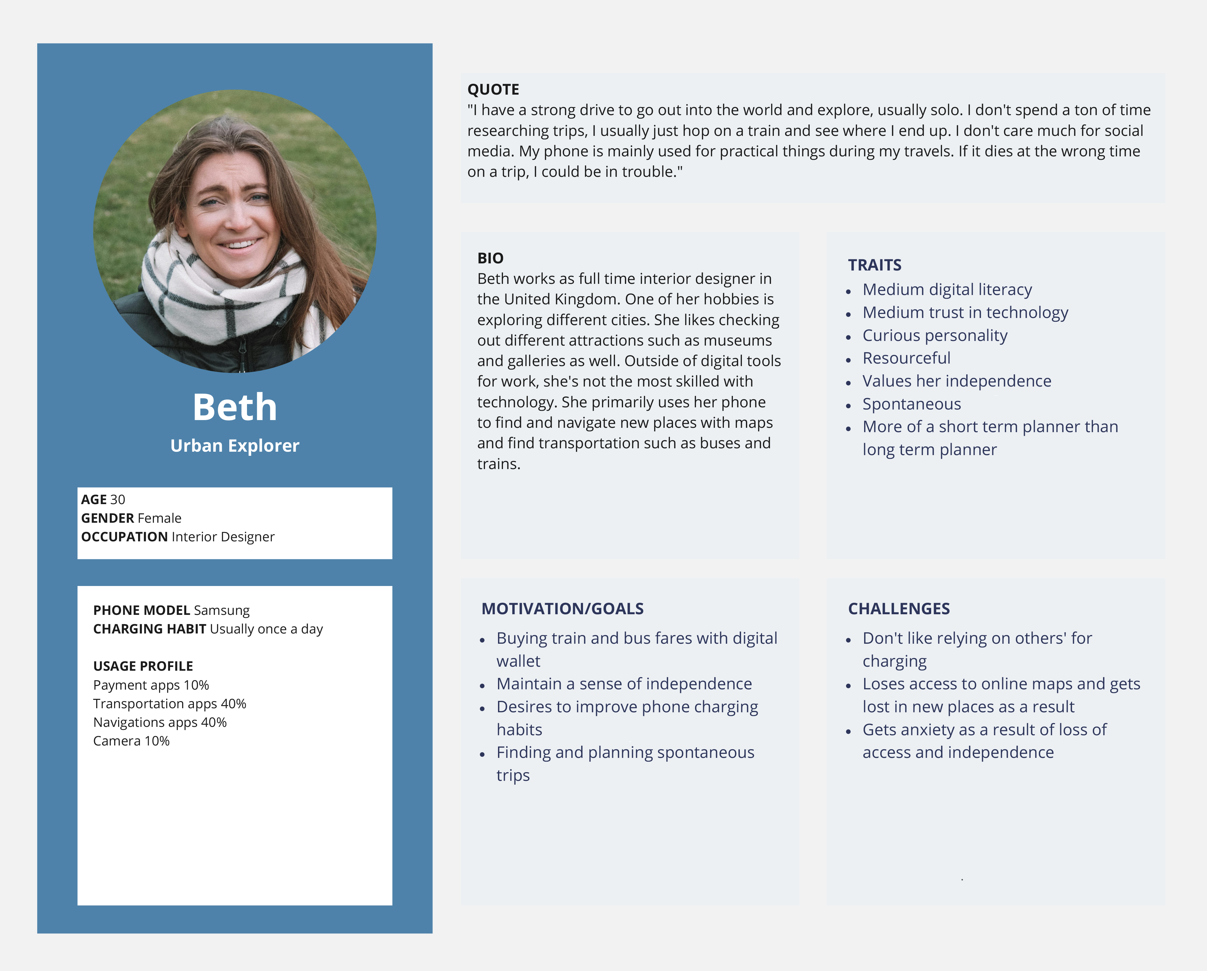
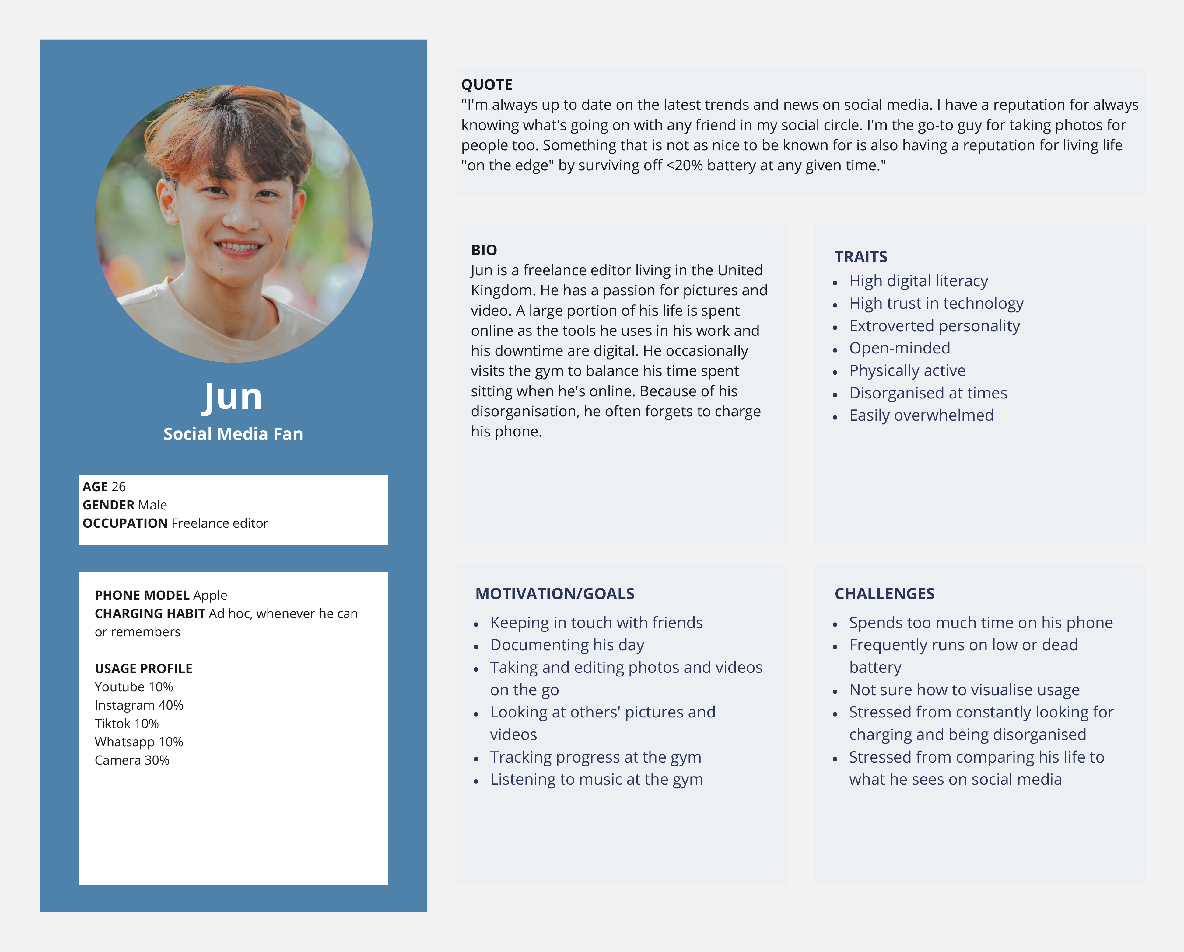
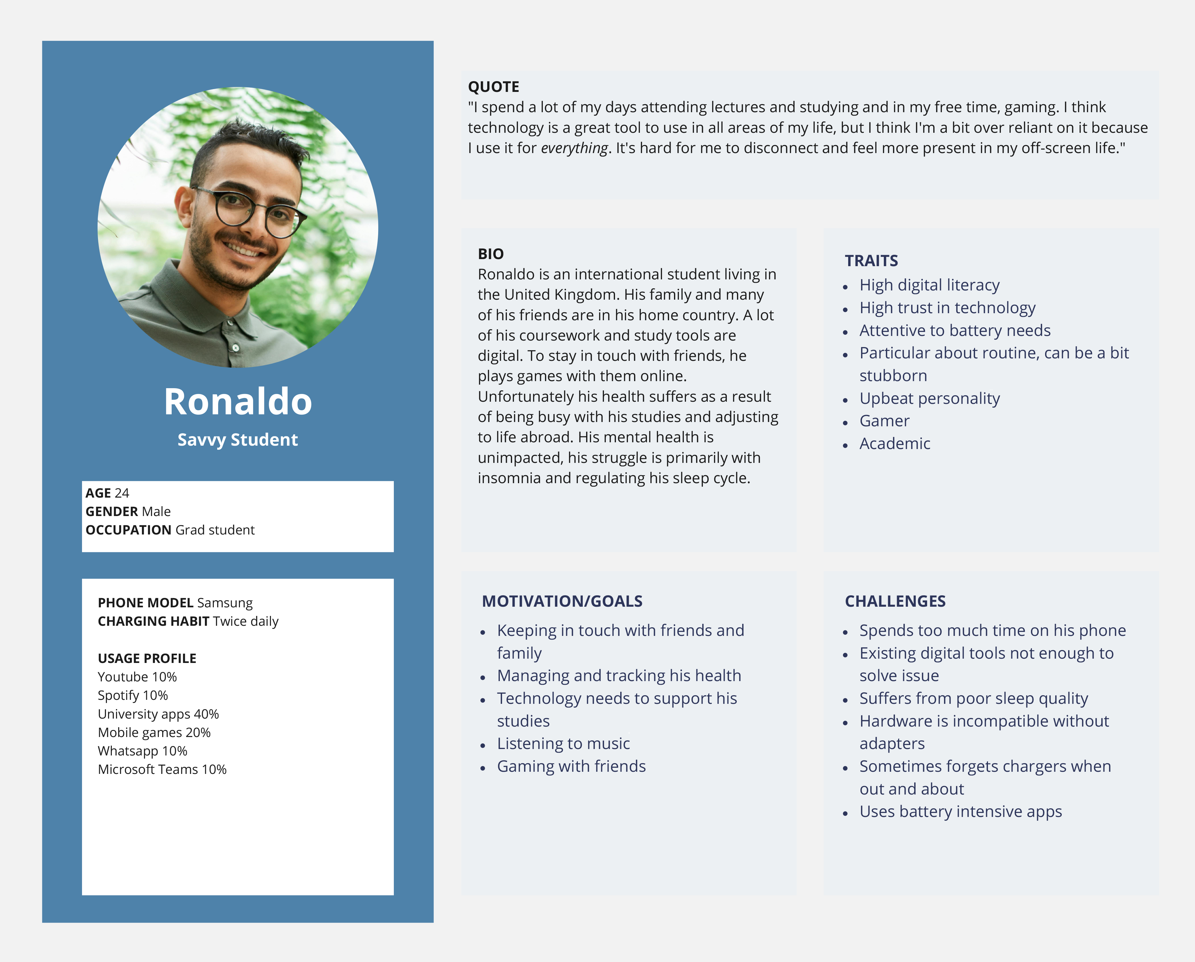
User Personas

Persona template with an image of smiling woman named Amber and user attributes. Persona template with an image of smiling woman named Beth and user attributes. Persona template with an image of smiling man named Jun and user attributes. Persona template with an image of smiling man named Ronaldo and user attributes.

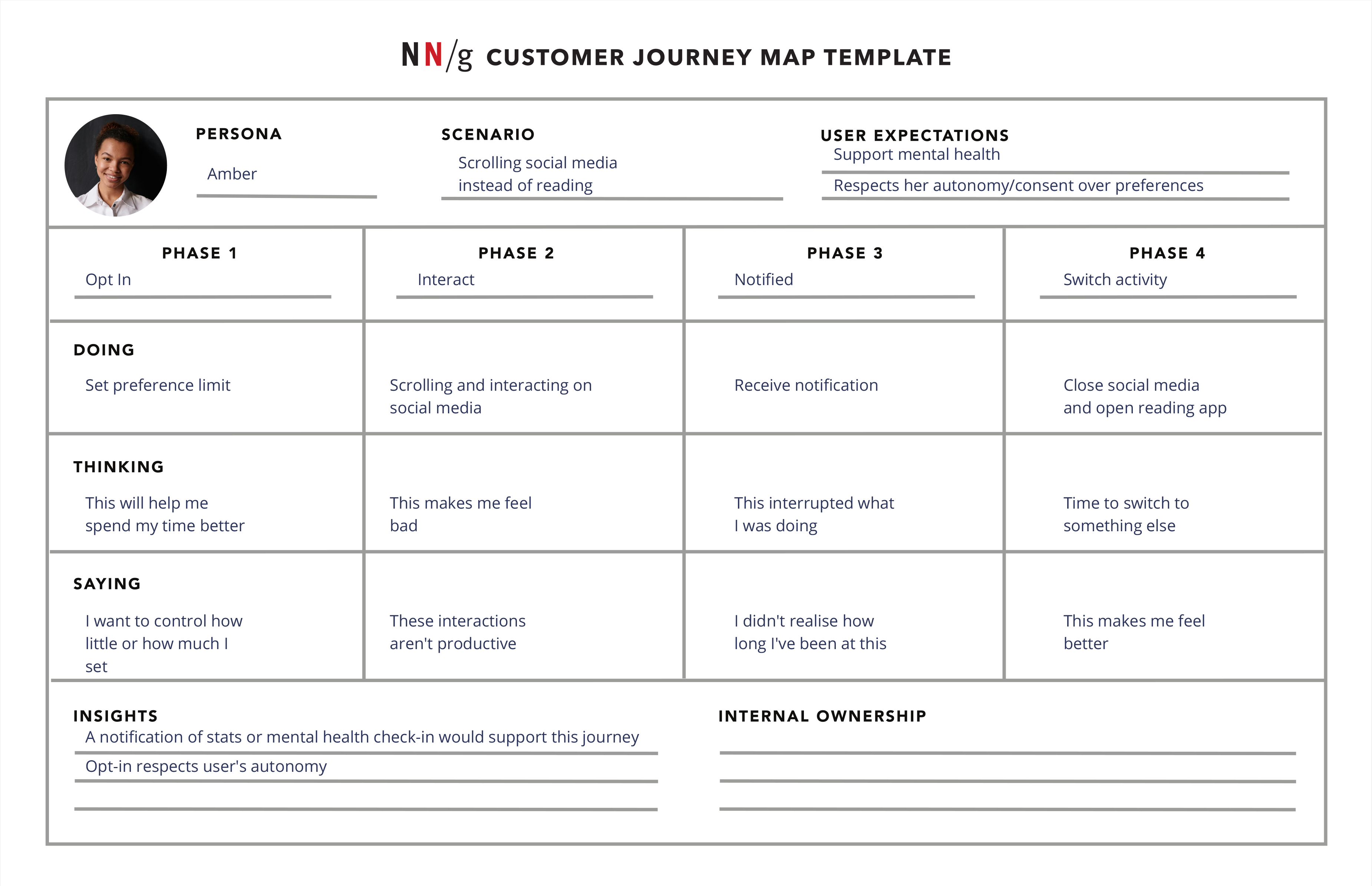
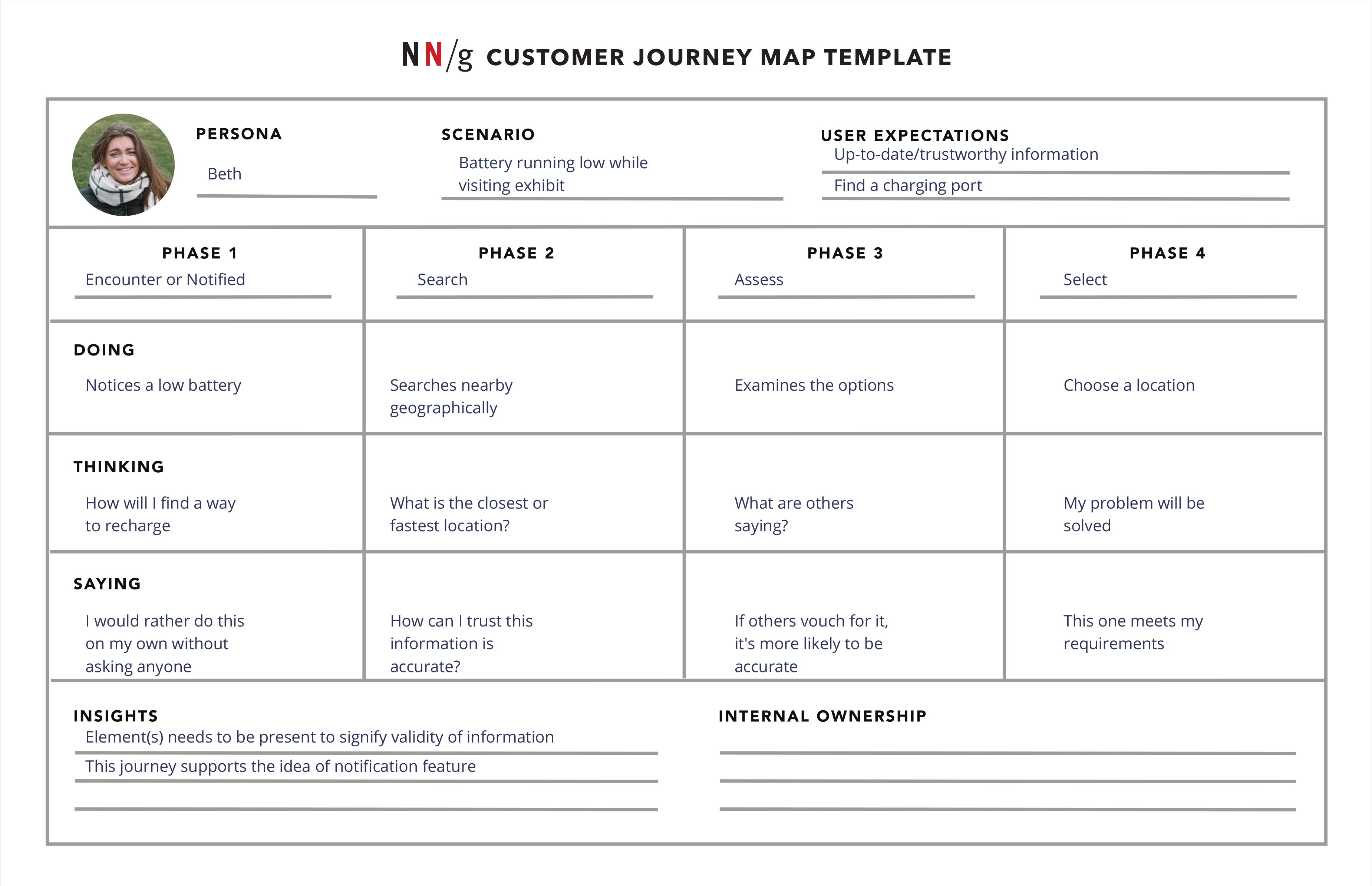
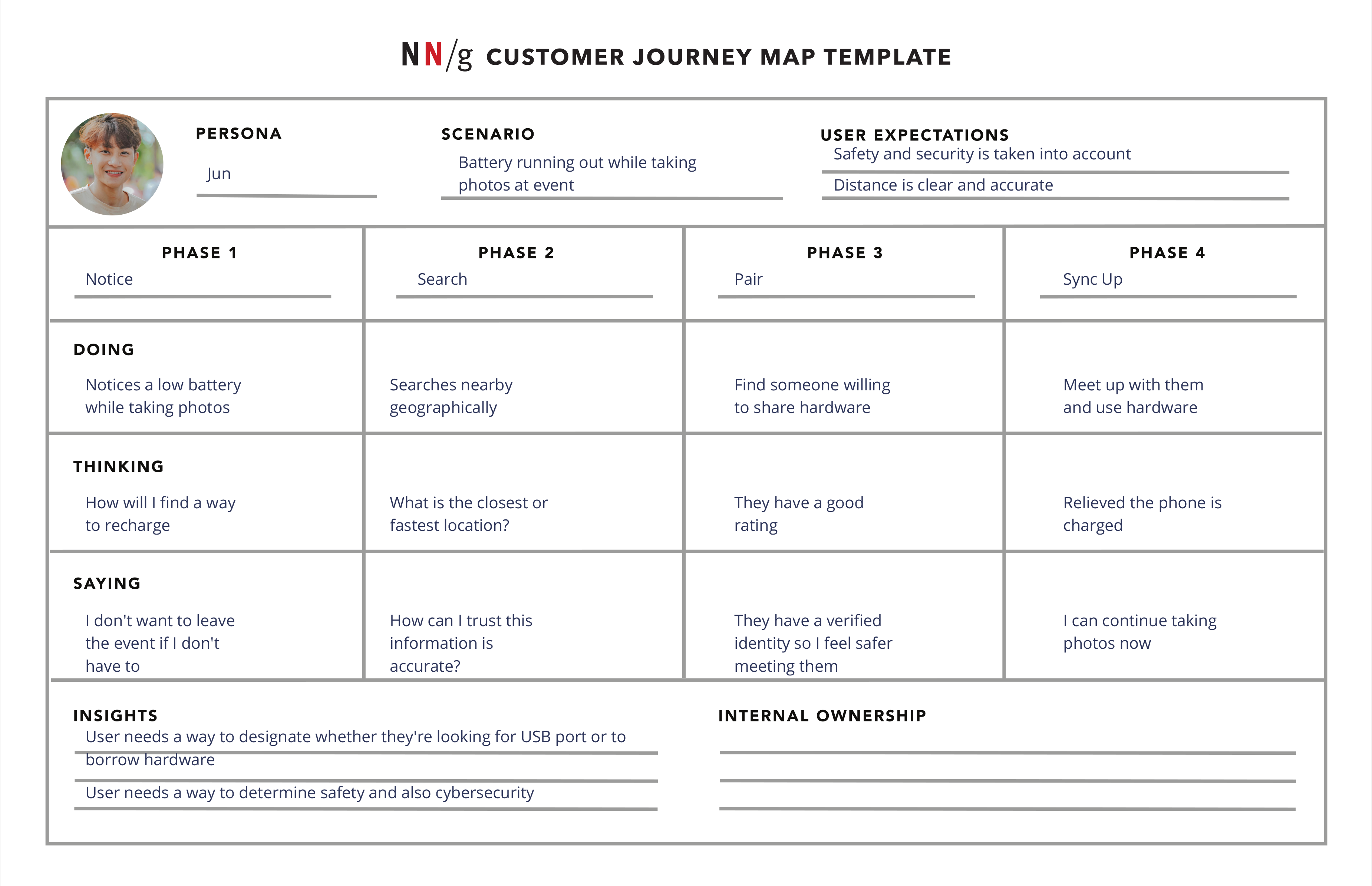
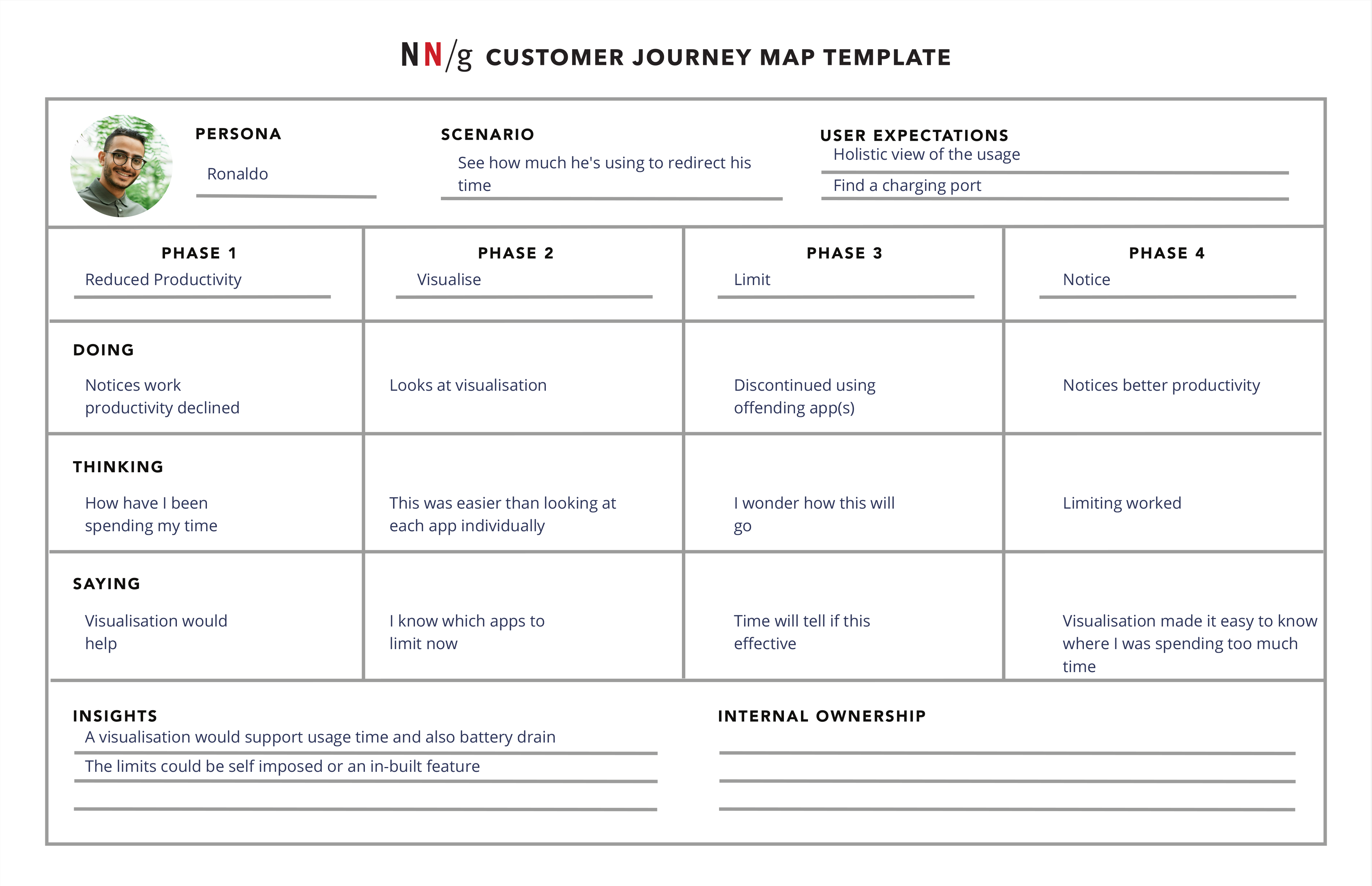
Customer Journey Mapping

Template describing stages of hypothetical situation of Amber needing to find charge for her phone. Template describing stages of hypothetical situation of Beth needing to find charge for her phone. Template describing stages of hypothetical situation of Jun needing to find charge for his phone. Template describing stages of hypothetical situation of Ronaldo needing to find charge for his phone.

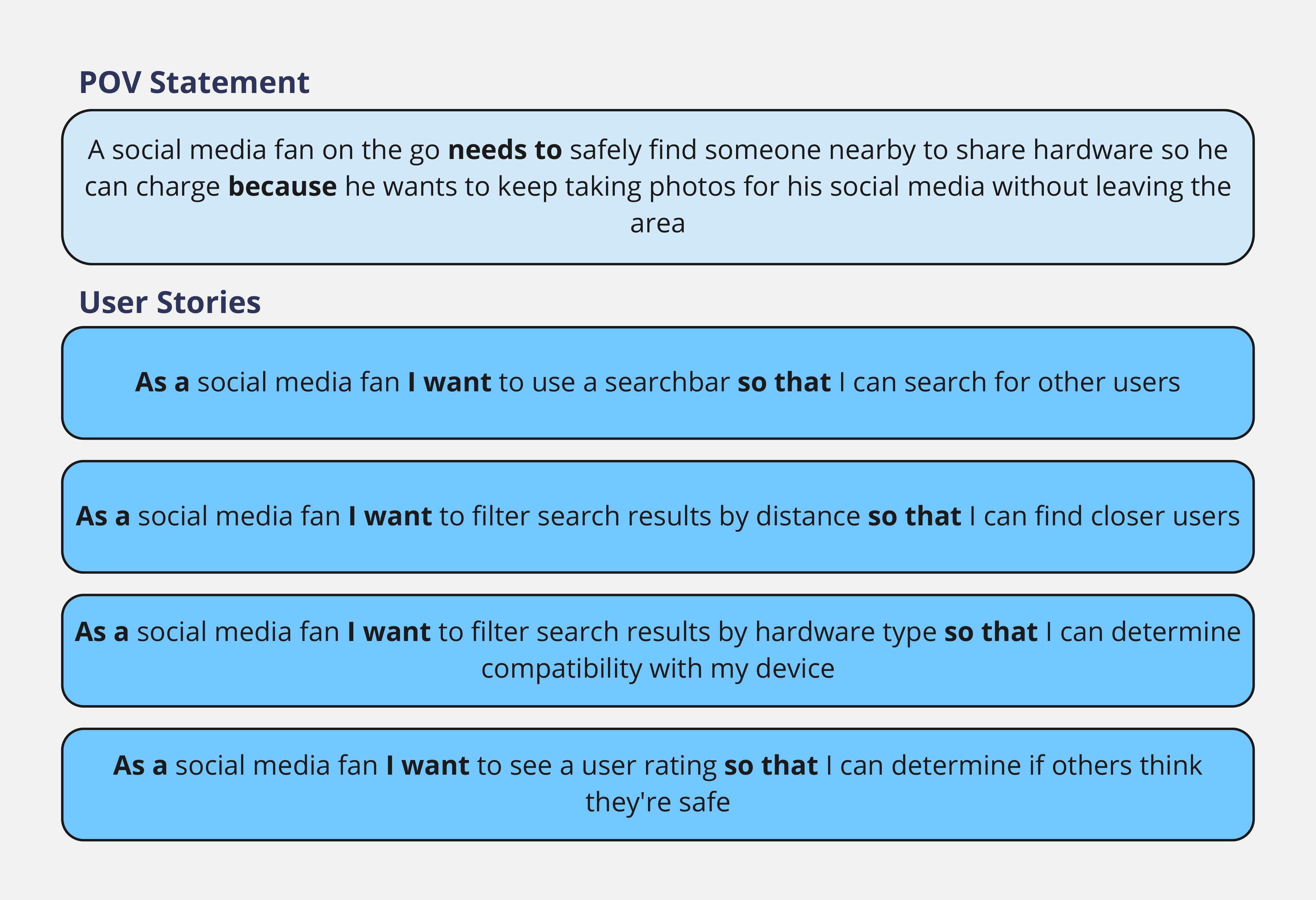
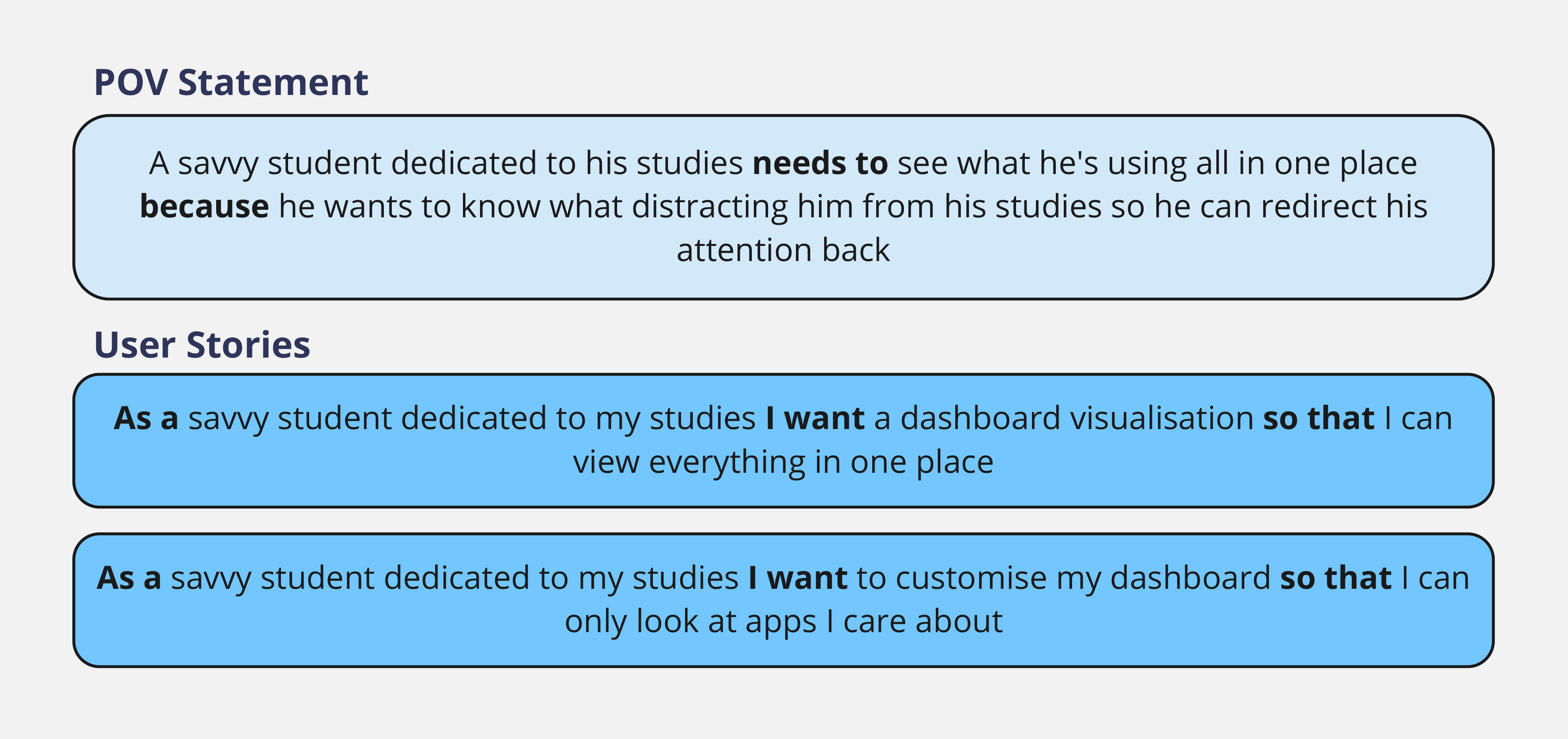
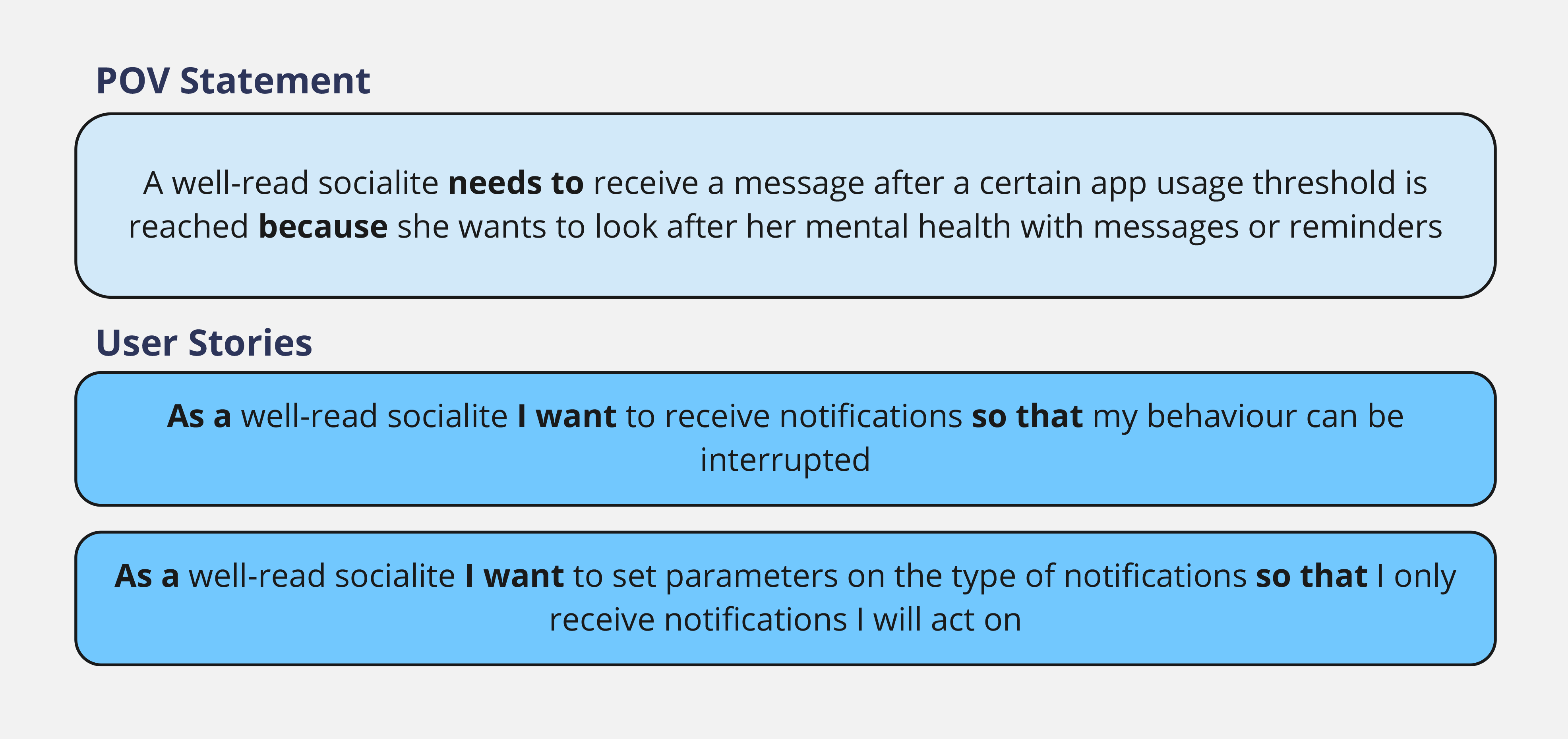
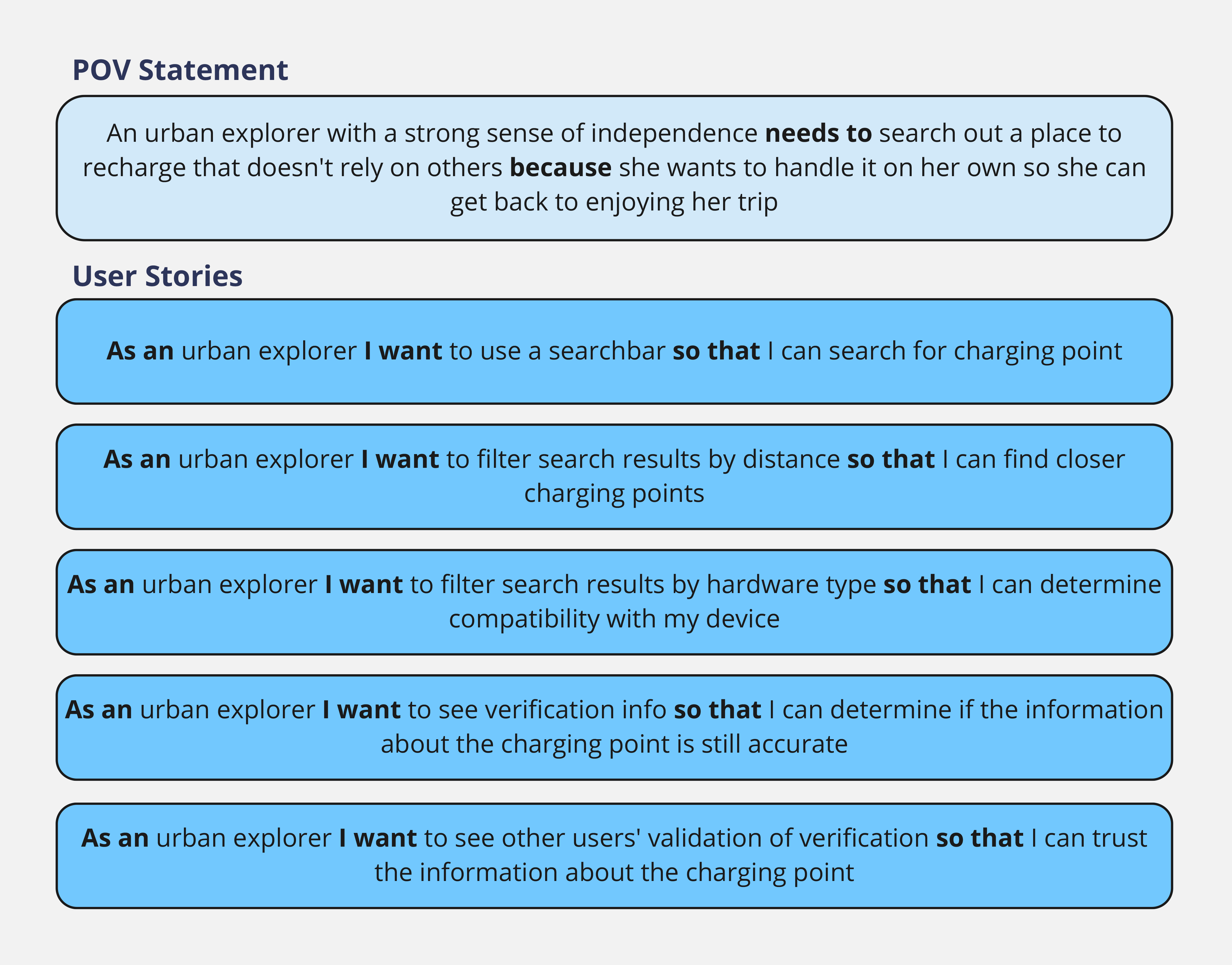
POV Statements & User Stories

Ideate

(click to expand)

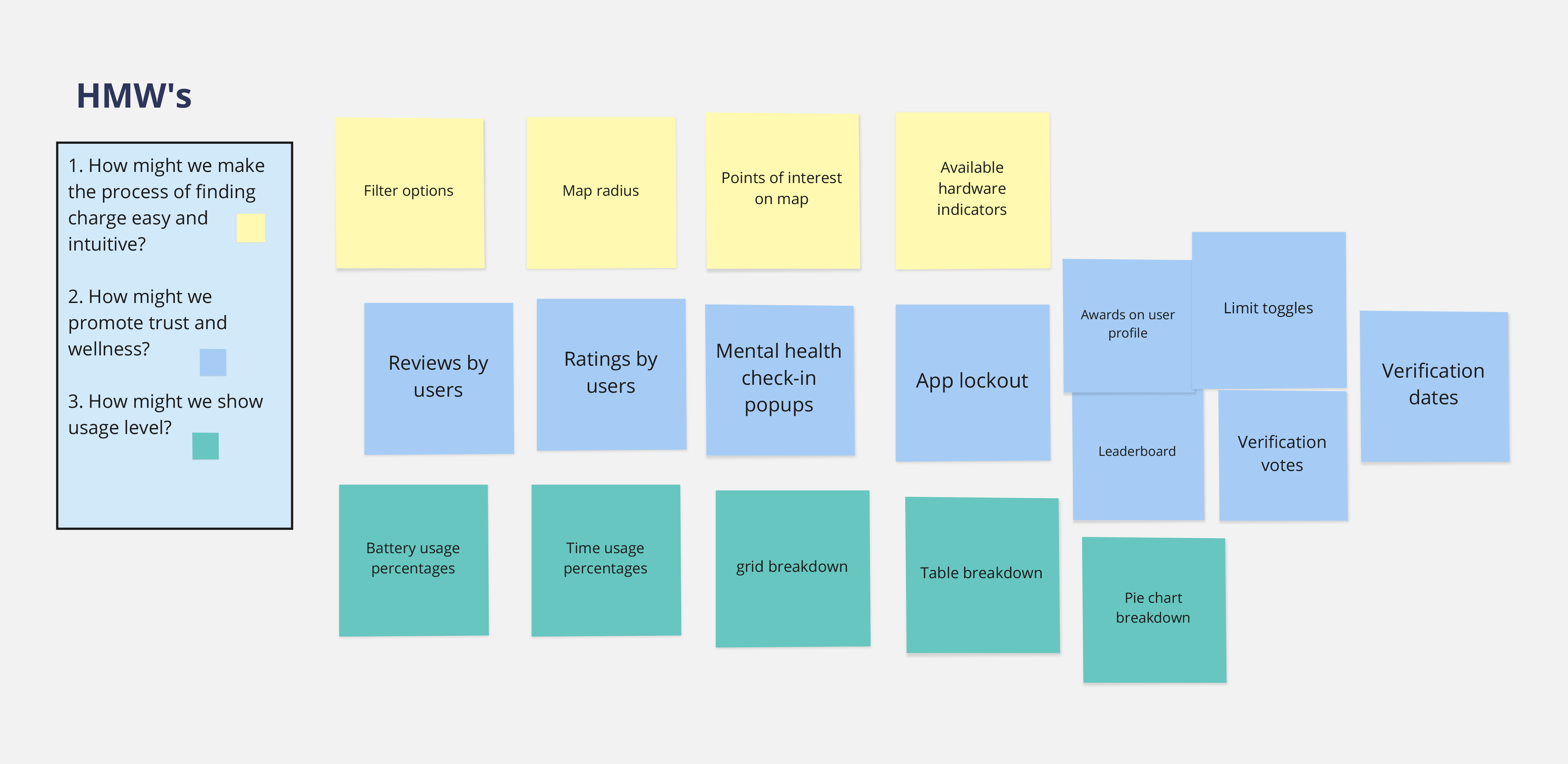
HMW (How Might We)

3 How Might We questions to the left with digital sticky notes with features on them to the right.

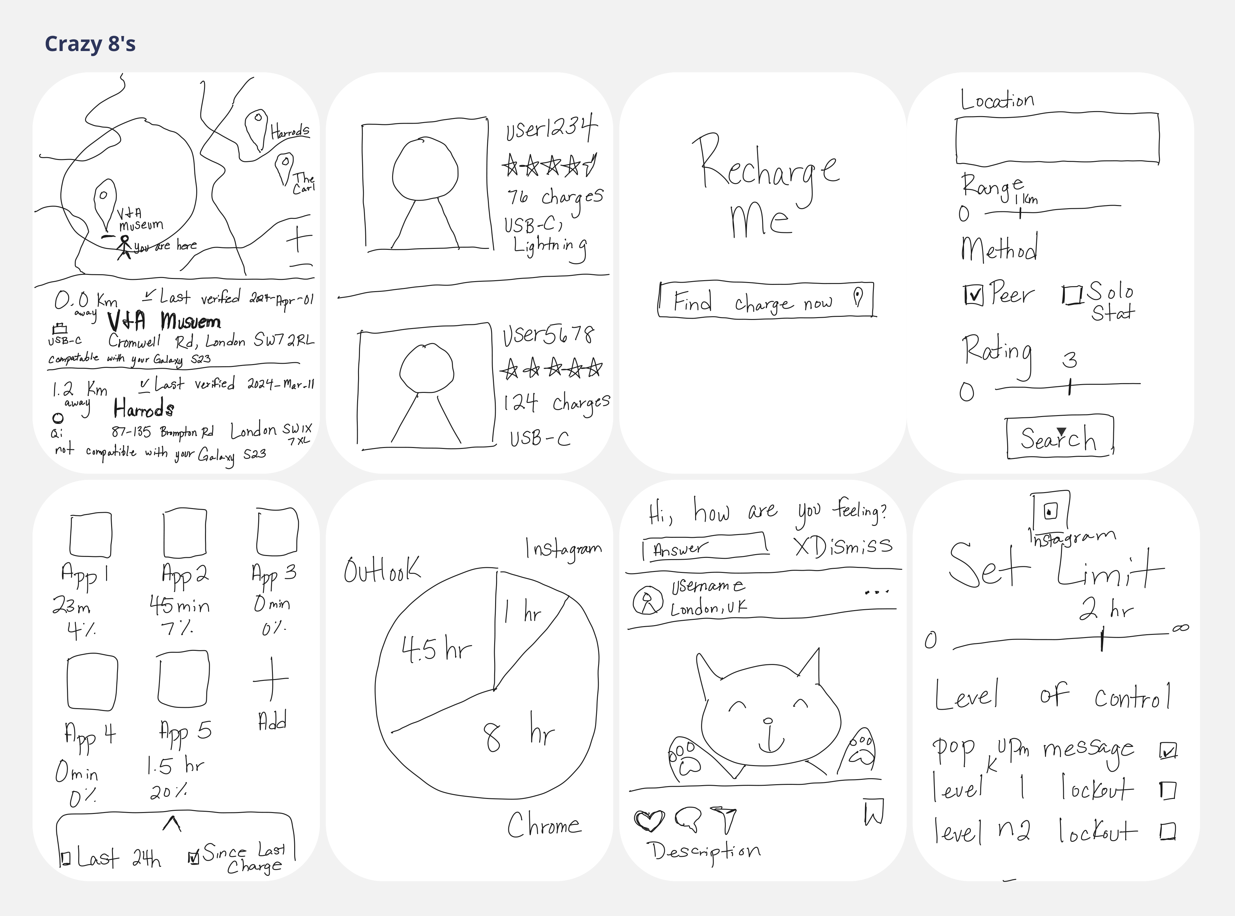
Crazy 8's

Crazy 8's are an ideation method to quickly get ideas out without boxing them in or restraining them. You sketch 8 ideas in 8 minutes. You can do it on a sheet of paper folded into 8 sections, but for this exercise I tried my hand at digital sketching. In restrospect, I should have used paper or a different software as Miro wasn't as suitable for the task as I would have liked(hence the shaky lines).

Regardless of the method, the outcome was still beneficial in that it kicked off some excellent starting points to answering the HMW questions.

8 digital illustrations of mobile app screens.

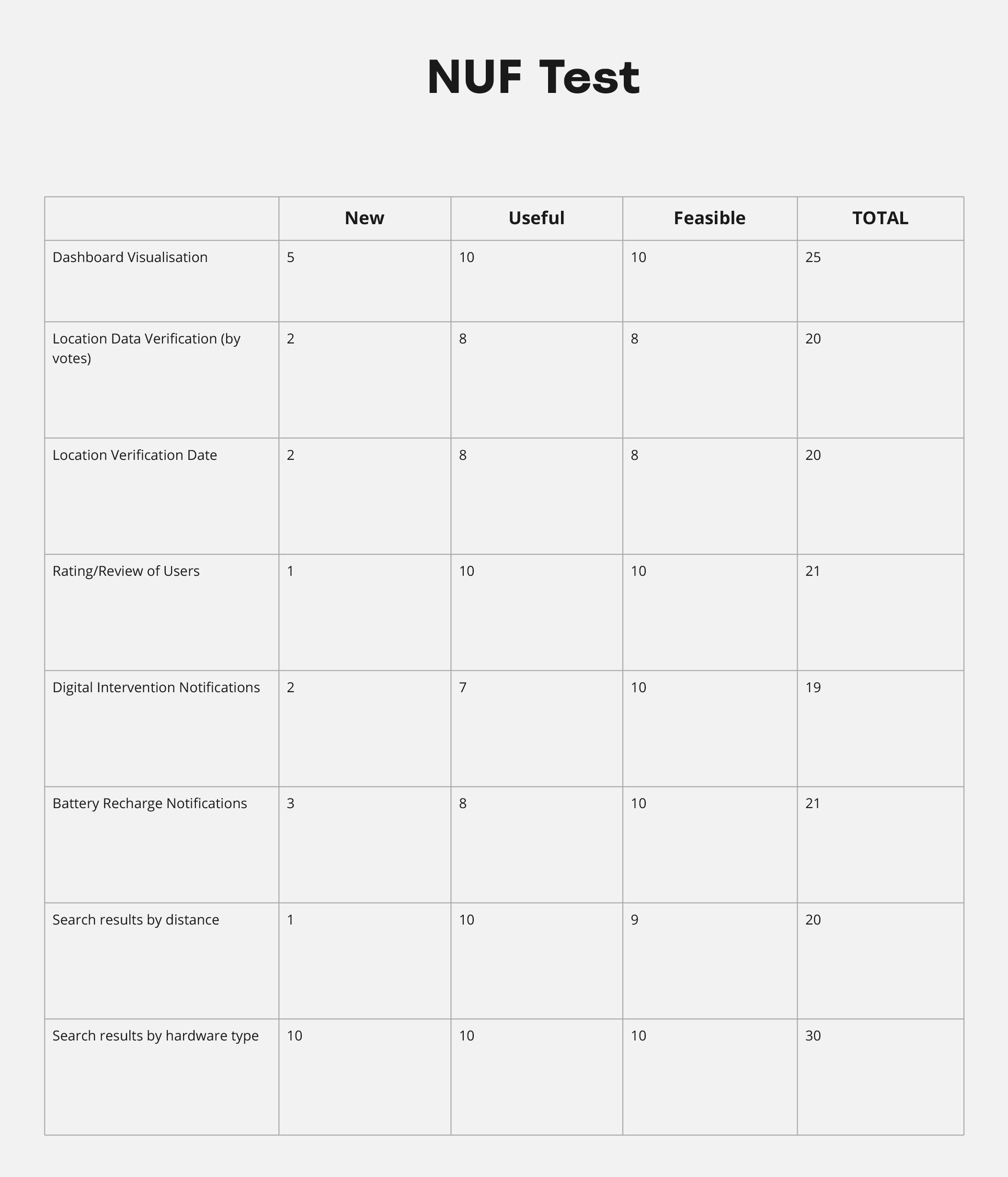
Final Feature List & NUF Test

NUF (New Useful Feasible) tests, as the name implies, assess the newness, usefulness, and feasibility of a particular feature.

Table of 8 features with numerical ratings between 1 and 10 for 3 attributes of newness, usefulness, and feasibility.

Prototype & Test

(click to expand)

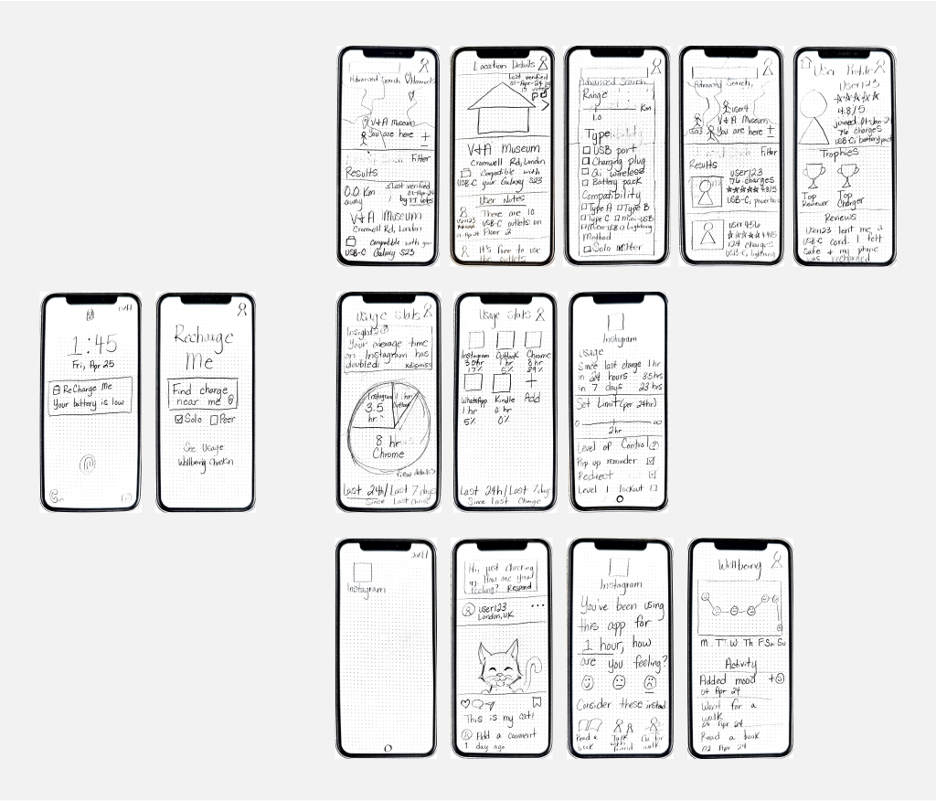
Low Fidelity Paper Prototype

14 hand drawn mobile app screens.

Low Fidelity Prototype Evaluation

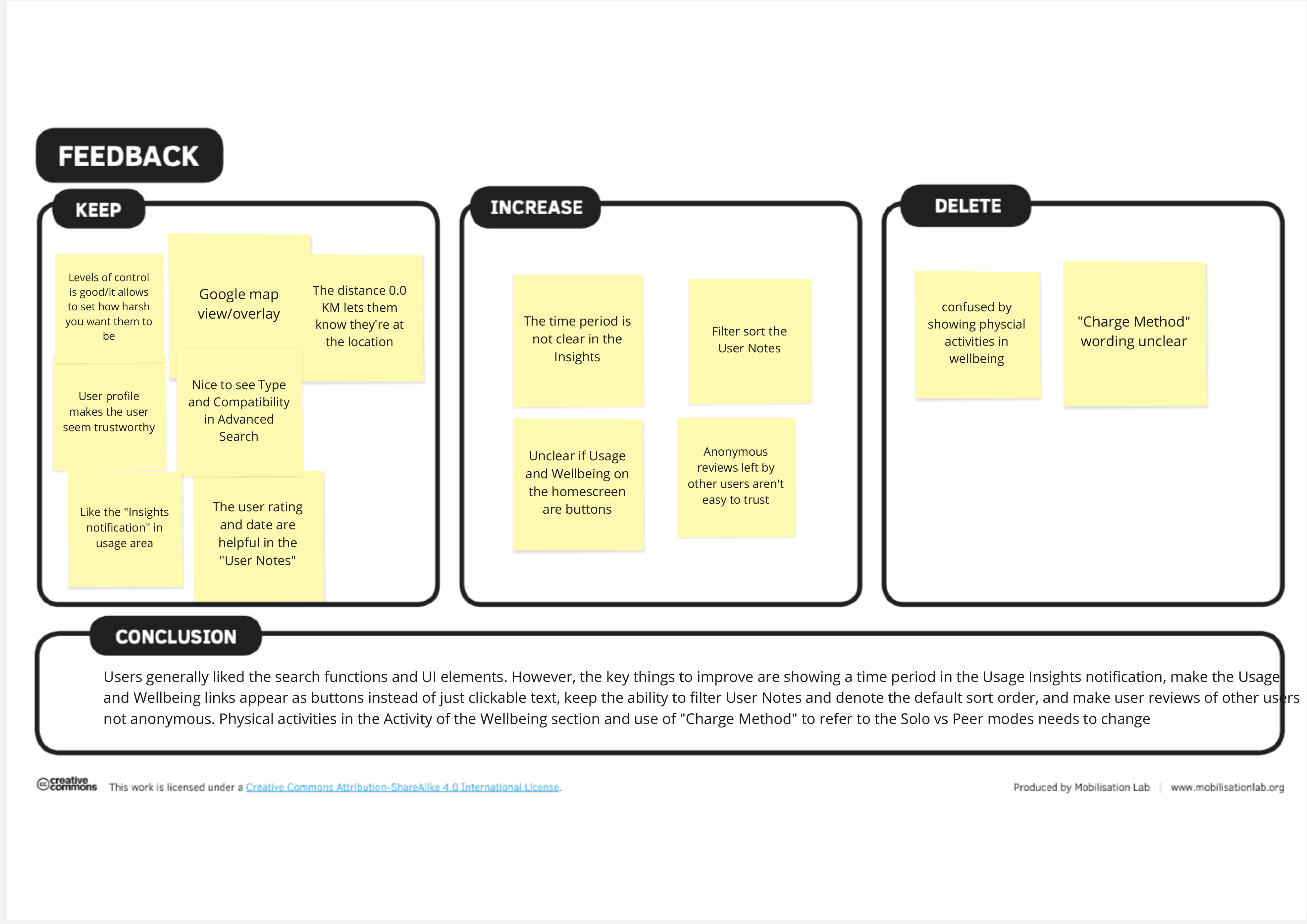
I evaluated the low fidelity paper prototype with the web-based prototyping tool Marvel app. I scanned, uploaded, and arranged the order of sketches of screens to Marvel App. I then added hotspots to the screens to simulate interaction and flow through the journey. I gave users a simple a simple task list and observed their behaviours and commentary without interference. I then used a canvas to sort features into categories of Keep, Increase, & Delete and then drew conclusions. Features were judged based on negative and positive comments and successful or unsuccessful interactions. Template with columns for 3 categories of Keep, Increase, and Delete and a section at the bottom for Conclusion.

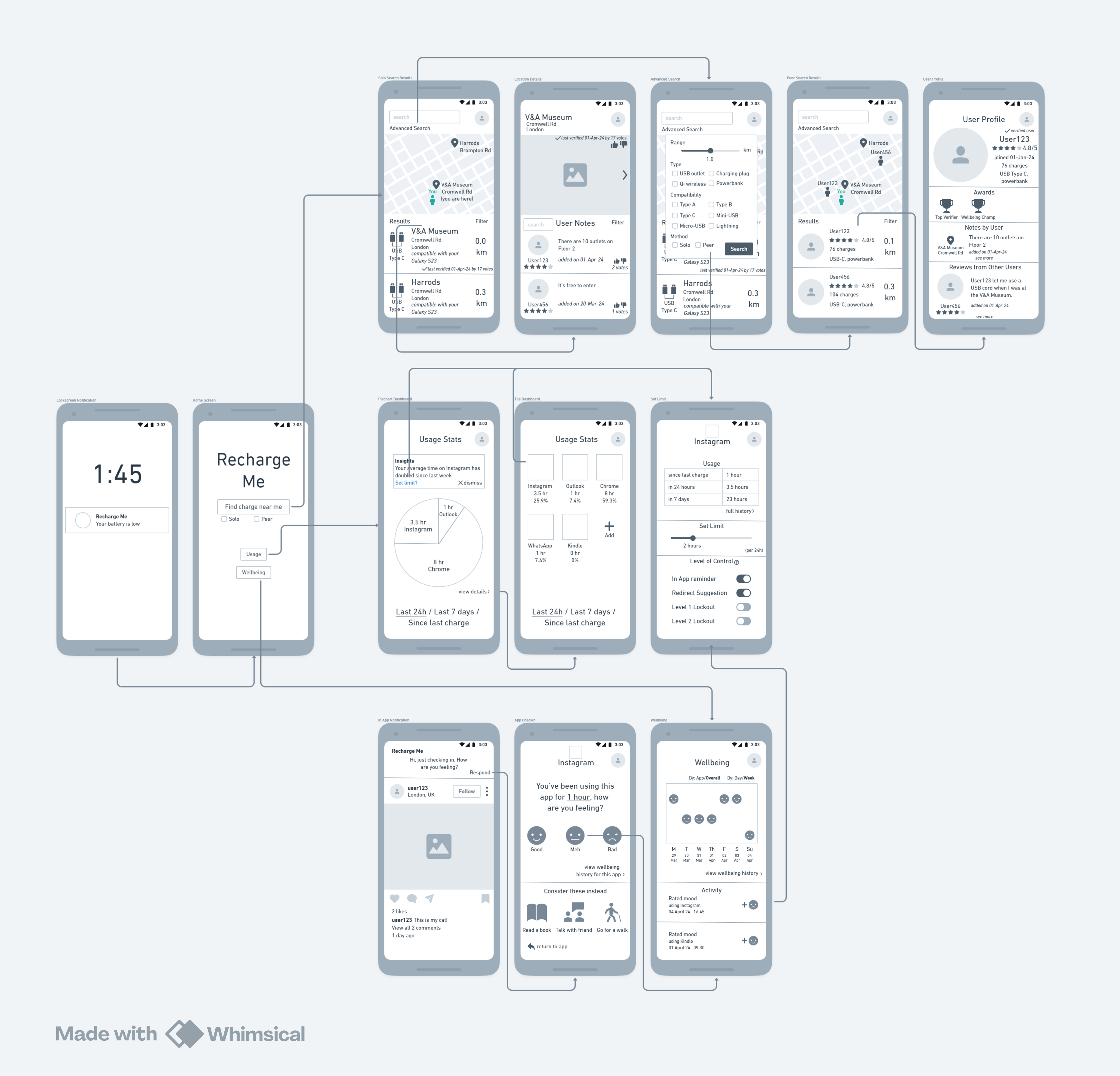
Mid Fidelity Wireflows

13 grayscale digital mobile app screens with arrows showing the flow between them.

Style Guide

This was my 2nd attempt ever at developing a style guide. (The 1st being during the development of Food Stock)

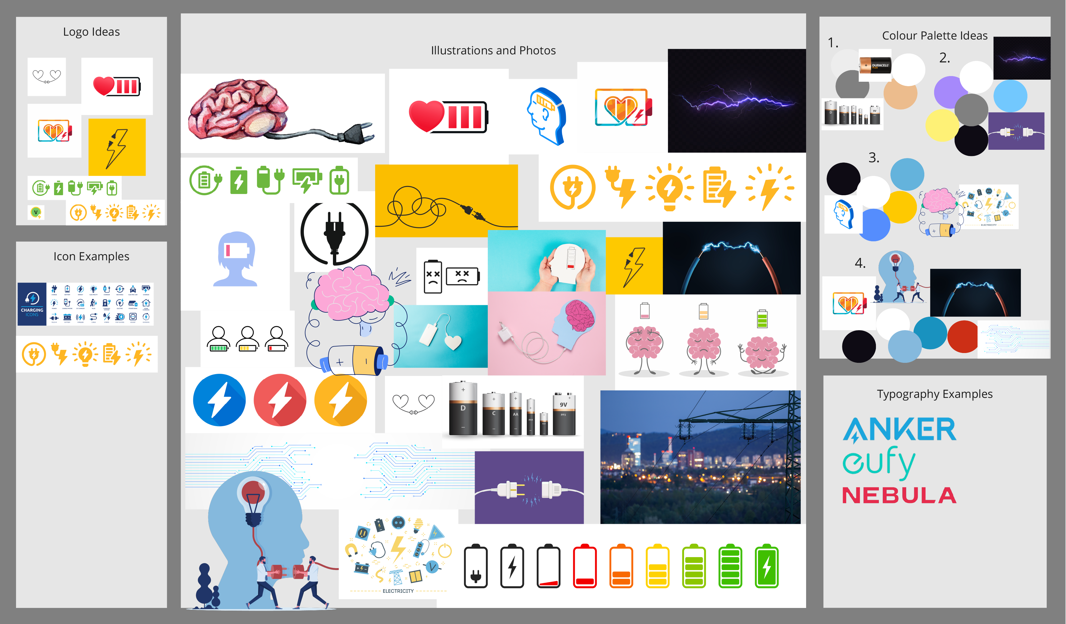
I started by making a mood board. I started by gathering images related to charging, electricity, batteries, as well as wellness (brains/hearts/etc)

  1. Logo
  2. Iconography.
  3. I knew I would need specialised icons related to phone charging hardware but didn't pull too many in during this step.
  4. Colour Palette.
  5. I extracted a few different colour palettes from my moodboard images. I intentionally didn't go for the typical palettes of green, yellow, and red associated with battery and charging products in order to stand apart and differentiate my product.
  6. Typography.
  7. I looked to known brands associated with charging for typography inspiration. I especially liked Anker and its brands' use of punchy colours and sans-serif fonts.
Collage of digital stock images of batteries and charging, with logo, icons, color palettes, and typography ideas around the collage.
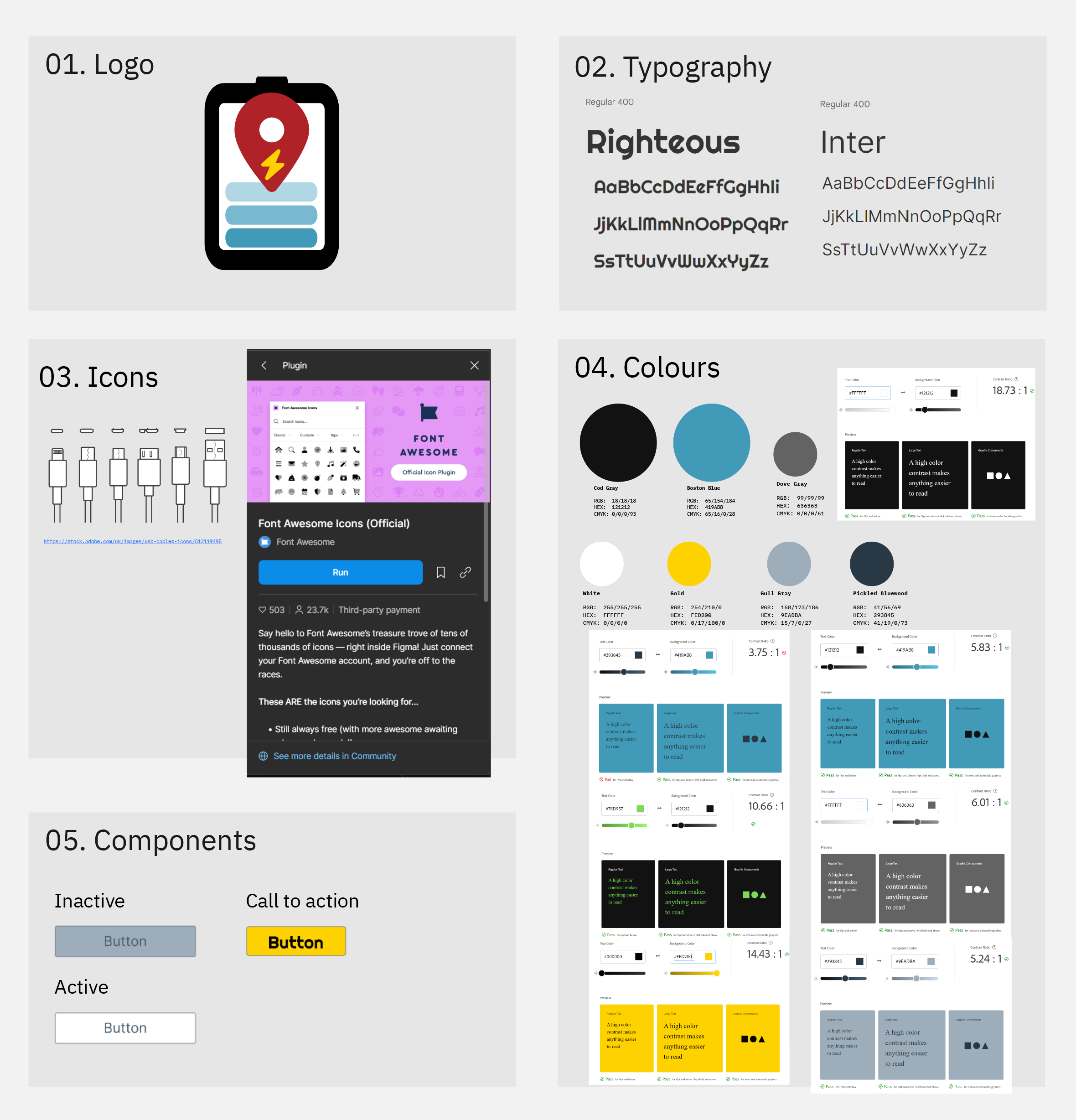
Logo of a recharging battery with a location pin on it, the chosen color palette featuring blue, yellow, dark gray, and white, 2 fonts, the name of the icon library used and also hardware icons.
  1. Logo.
  2. I made the logo in Adobe Illustrator. I used the gradient colouring of the battery bars to indicate charging. I used a location pin shape to indicate the association with locations/geography. I selected the lightning bolt and overlaid it over the location to reinforce that the locations are about charging.
  3. Typography.
  4. Iconography.
  5. For a majority of the icons, I used fontawesome's icon library. I have some web design experience and learned that implementing their library is just 1 line of code. Rather than referencing many different libraries, I find it easier to reference just one. For the specialty icons such phone hardware types, I sourced icons from Adobe Stock and adapted them to the mobile screens.
  6. Colour Palette.
  7. I opted to move forward with a colour palette that favoured blue and yellow because I was drawn to the complementary colour relationship, and I liked that yellow could be used for icons or other elements related to electricity. I chose the almost black, dark grey colour (HEX #121212) for 2 reasons. Darker colours are less battery drain which aligns with the goal of helping users manage battery. I almost opted for black (HEX #000000) but changed to #121212 after reading on this page that placing things "such as complex colorful vector animations and bright imagery against a pure black background means that the resulting contrast is much higher, which can increase eye strain." High contrast is vital for accessibility, but I also didn't want to contribute to eye strain. Hence, #121212 which still has good contrast with white text.
  8. Components.

High Fidelity Prototype

Higher quality color version of the mid fidelity wireflow image showing 12 mobile screens and 3 menus as they would appear in the final version of the app to end users. Link to prototype

High Fidelity Prototype Evaluation

I evaluated the high fidelity prototype using a process called the 5 Act Interview which is a structured 1-on-1 interview format pioneered at Google. As the site states, the 5 Act Interview "builds a narrative arc that walks users through a high fidelity prototype to gain valuable insights. By immersing your user into the experience, you increase the chances to get the most realistic feedback." Therefore, I designed the questions to be open-ended without leading the user to draw certain conclusions. After the data was collected, I extracted key information from the interviews onto sticky notes. After I created the sticky notes, I did affinity diagramming to identify patterns and sort them accordingly into groupings called "codes". 5 codes emerged at the end- Familiarity, Safety, Visual Indicators, Convenience, & Simplicity

5 groupings of digital sticky notes with key phrases from interviews on them.

Walkthrough video

Learnings

(click to expand)

Strengths

The strength of this project is that it kept users at the forefront by incoporating Design Thinking. Frequent touchpoints and evaluations with users provided the feedback loops needed to form insights and then evaluate those insights.
Keeping the idea of a user having low battery while using the app in mind is another strength. Decisions such as a dark less-battery intensive background and abbreviated flow between starting and finding reliable charge support this. Trust, safety, and verification of locations and other users that was supported in the evaluation data is also a strength.

Weaknesses

This project would have benefited from more time spent in the ideation phase utilising more varied ideation techniques. The decision to spend less time was due to the perception that there was a lot of potential already surfaced within the research and initial ideating. While that is not an incorrect perception, it would still be a net positive to have a variety of ideas.
This project also would have benefited from identifying design principles and a stronger sense of best practices in visual design to make the appearance more cohesive and coherent.
The idea, even though supported by research, is ambitious and could have been pared down to a simpler level. Although great efforts were taken to manage scope, scope creep was a constant challenge between prototyping enough to make the evaluation functional while also building out the features represented in the user stories.

Future work

References

(click to expand)

  1. Ackermann, J. (2023) Design thinking was supposed to fix the world. Where did it go wrong?. Available at: https://www.technologyreview.com/2023/02/09/1067821/design-thinking-retrospective-what-went-wrong/ (Accessed: February 25, 2024).
  2. Al-Mansoori, R., Al-Thani, D. and Ali, R. (2023) 'Designing for Digital Wellbeing: From Theory to Practice a Scoping Review', Human Behavior and Emerging Technologies, 2023 pp.1-24. Available at: https://dx.doi.org/10.1155/2023/9924029.
  3. Alutaybi, A. et al. (2020) 'Combating fear of missing out (Fomo) on social media: The fomo-r method', International Journal of Environmental Research and Public Health, 17(17), pp.1-28. Available at: https://dx.doi.org/10.3390/ijerph17176128.
  4. Bulut, E., Hernandez, S., Dhungana, A., & Szymanski, B. K. (2018). Is Crowdcharging Possible? In Proceedings of the 27th International Conference on Computer Communications and Networks (ICCCN'18), Hangzhou, China, July 30-August 2, 2018.
  5. Dai, C., Tai, Z. and Ni, S. (2021) 'Smartphone Use and Psychological Well-Being Among College Students in China: A Qualitative Assessment', Frontiers in Psychology, 12 pp.708970. Available at: https://dx.doi.org/10.3389/fpsyg.2021.708970.
  6. Dhungana, A., Arodz, T. and Bulut, E. (2019) 'Exploiting peer-to-peer wireless energy sharing for mobile charging relief', Ad Hoc Networks, 91 pp.101882. Available at: https://dx.doi.org/10.1016/j.adhoc.2019.101882.
  7. Lyngs, U. et al. (2022) 'The Goldilocks level of support: Using user reviews, ratings, and installation numbers to investigate digital self-control tools', International Journal of Human-Computer Studies, 166 pp.102869. Available at: https://dx.doi.org/10.1016/j.ijhcs.2022.102869.
  8. Monge Roffarello, A. and De Russis, L. (2024) 'Hey StepByStep! Can you teach me how to use my phone better?', International Journal of Human-Computer Studies, 183 pp.103195. Available at: https://dx.doi.org/10.1016/j.ijhcs.2023.103195.
  9. Neubauer, J. and Wood, E. (2014) 'The impact of range anxiety and home, workplace, and public charging infrastructure on simulated battery electric vehicle lifetime utility', Journal of Power Sources, 257 pp.12-20. Available at: https://dx.doi.org/10.1016/j.jpowsour.2014.01.075.
  10. Ramsden, D. (2023) The limitations of the Double Diamond [Blog post]. Available at: https://danramsden.com/2023/07/26/the-limitations-of-the-double-diamond/ (Accessed: February 25, 2024).
  11. Roffarello, A.M. and De Russis, L. (2023) 'Achieving Digital Wellbeing Through Digital Self-control Tools: A Systematic Review and Meta-analysis', ACM Transactions on Computer-Human Interaction, 30(4), pp.1-66. Available at: https://dx.doi.org/10.1145/3571810.
  12. Soundararajan, A. et al. (2023) 'Smartphone ownership, digital literacy, and the mediating role of social connectedness and loneliness in improving the wellbeing of community-dwelling older adults of low socio-economic status in Singapore', PloS One, 18(8), pp.e0290557. Available at: https://dx.doi.org/10.1371/journal.pone.0290557.
  13. Vanden Abeele, M.M.P. (2021) 'Digital Wellbeing as a Dynamic Construct', Communication Theory, 31(4), pp.932-955. Available at: https://dx.doi.org/10.1093/ct/qtaa024.
  14. WILSON, C. (2018) 'Is it love or loneliness? Exploring the impact of everyday digital technology use on the wellbeing of older adults', Ageing and Society, 38(7), pp.1307-1331. Available at: https://dx.doi.org/10.1017/S0144686X16001537.
  15. Yang, C.C. et al. (2023) 'Digital Social Multitasking (DSMT), Digital Stress, and Socioemotional Wellbeing Among Adolescents', Cyberpsychology, 17(1),Available at: https://dx.doi.org/10.5817/CP2023-1-6.

Victoria Law, UX/UI Designer

PORTFOLIO UNDER CONSTRUCTION